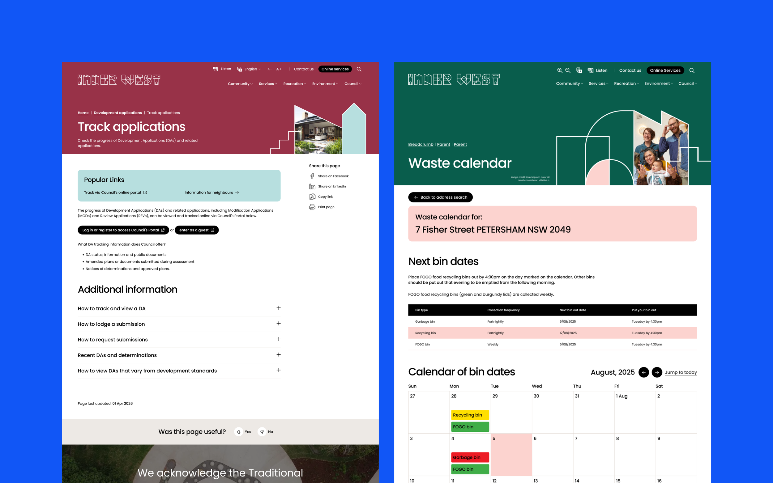
Inner West Council
Inner West Council (IWC) is a local government in Sydney, Australia, serving a vibrant and diverse community across the Inner West. The council supports residents through a wide range of local services, programs and initiatives that reflect the area’s creative and multicultural character
The problem space
Inner West Council’s website had evolved over time into a fragmented experience shaped more by internal structures than by the needs of residents and visitors.
Content had accumulated across departments, navigation reflected organisational silos, and key tasks were often buried within dense pages or unclear pathways. At the same time, Council was planning a broader Digital Experience Platform to support online services, creating an opportunity to rethink the website as the public facing foundation of that ecosystem.
The redesign focused on making the experience easier to use across devices, improving accessibility, clarifying calls to action, and creating a more intuitive information architecture that helped people find what they needed faster. It also needed to reflect Council’s colourful brand in a way that felt thoughtful, clear and contemporary.
Within a four month timeline, the goal was to turn a dated and hard to navigate website into a more modern, user centred experience built around findability and task completion.
Scope
Discovery • Information Architecture • Co-design • Wireframing • Functional Specification
My role
I was the UX Lead for the Inner West Council website redesign, helping shape the project from the RFQ pitch through to functional specification.
I led the UX approach across discovery, information architecture, tree testing and wireframing, and worked closely with the project manager, UI designer and Council stakeholders to keep the work aligned with user needs, Council priorities and technical constraints.
Setting the direction
I planned and facilitated a three hour kickoff workshop at Inner West Council’s office with the cross functional project team. Using a structured FigJam board and prompts drawn from the RFQ, the session aligned the team on goals, success measures and the core issues affecting the current website experience.
A few priorities emerged early. Council had limited capacity to manage content and often needed to balance competing internal needs. Mobile use was significant, with 61% of traffic coming from smaller screens. It was also important to define the role of each platform clearly: the website would be informative, while the DXP would support transactional services.
The session also reinforced persistent usability issues. Community feedback consistently pointed to poor clarity and difficult navigation, while search was identified as a critical but underperforming pathway. Stakeholders also wanted to avoid cluttered page layouts, including the traditional in page sidebar navigation common on many council sites.
Together, these findings shaped the direction of the work: clearer navigation, stronger search, and a more scalable information architecture built around how people actually use the site.
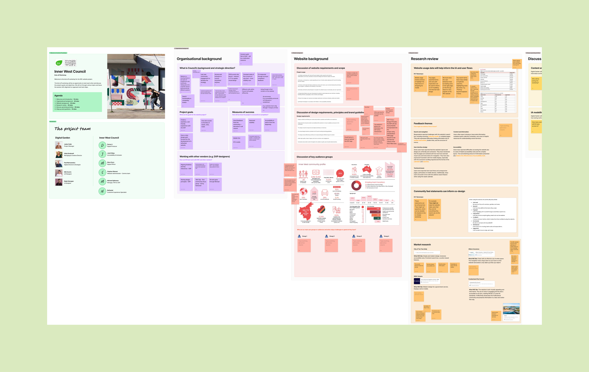
Figjam used to structure the workshop
Building a clearer IA
The existing IWC website was organised around lifestyle labels (Explore, Live, Work, Contribute) that were ambiguous overlapping. High frequency tasks like rates, waste and reporting issues were often buried several levels deep, and similar content appeared in multiple places.
Early in the project, I facilitated a two hour in person Content and Information Architecture workshop at Council’s office. The session combined a short landscape review of other council IA, an open card-sorting activity using the existing menu items, and a discussion about content workflow (publishing, ownership, metadata and SEO).
The card sort produced six clear clusters (Community, Services, Play, Environment, Build, Council) that became the starting point for the first IA concepts. After the workshop, I translated the evolving sitemap into a spreadsheet model so we could track depth, duplication and content type overlap across iterations. This working model helped us make decisions consistently, especially where topics naturally wanted more than one “home” (for example “Waste” spanning Services and Environment).
From there, the sitemap evolved through successive iterations: an early model that separated Business and Recreation as distinct top level areas, followed by a consolidation pass that merged “Build” and “Business” into clearer service based groupings and tightened labels for high frequency tasks (for example “Find your bin night”). Across iterations, I reduced overlap by assigning a clear primary home for each topic, then relying on cross links and search rather than duplicating content.
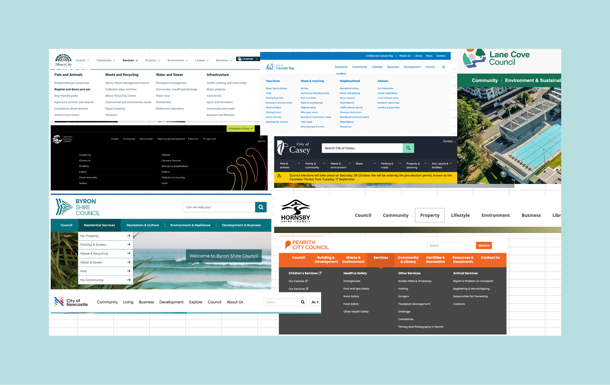
A landscape review was used to set the tone for IA and navigation
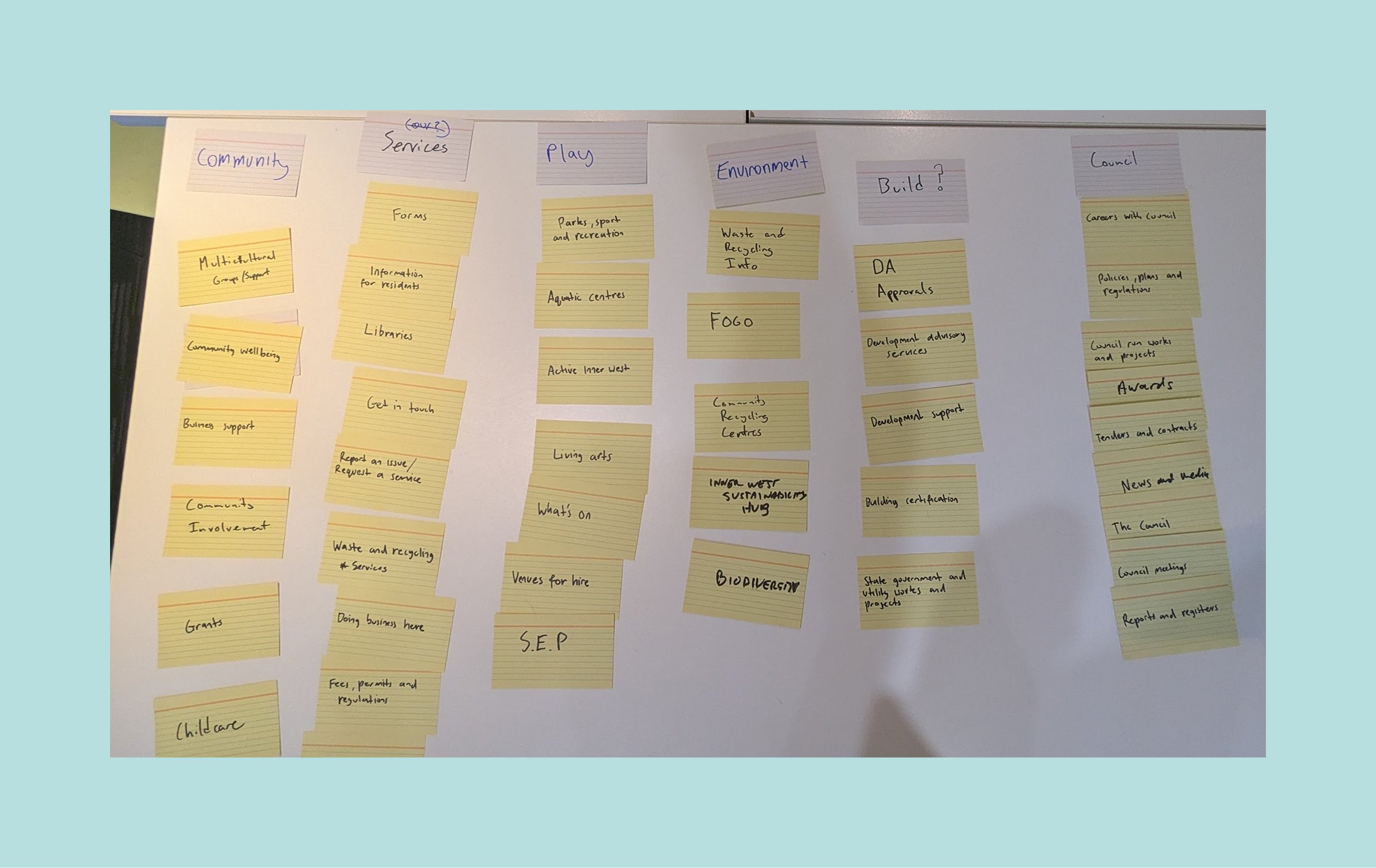
Output from the card sorting revealed direction for top level structure
Validating the structure
I used tree testing to validate the draft IA and identify where labels, grouping and pathways still needed refinement. Across 10 priority tasks, the tree achieved a 67% success rate and 65% directness, giving a clear picture of where the structure aligned with user expectations and where it still needed work.
Most tasks performed reasonably well, which gave confidence that the broader architecture was heading in the right direction. The study also had strong uptake, with 314 completions across staff and community participants, making it a useful source of evidence before finalising the structure.
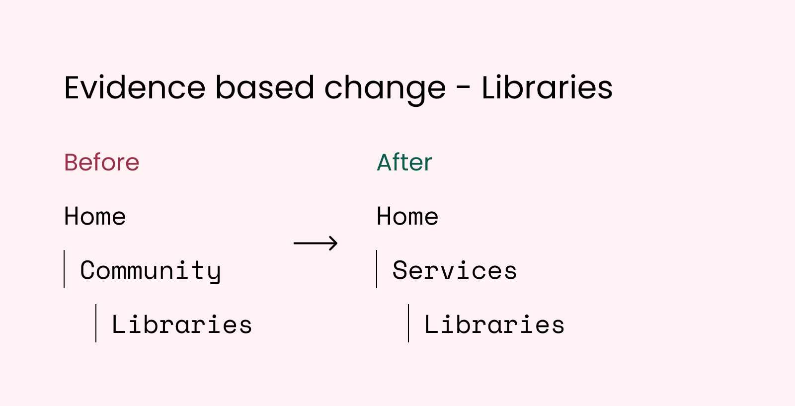
The weaker tasks pointed to specific issues with wording, placement and visibility rather than broader structural failure. Libraries performed strongly overall, but many participants looked under Services first, suggesting a mismatch between the proposed grouping and user expectations. Waste exposed confusion between Waste calendar and Household bins, while lower success on Your Say Inner West and mixed pathways for What’s On showed that consultations and events needed clearer signposting and stronger placement in the tree.
I used these findings to refine the next IA iteration, including moving Libraries under Services, tightening labels for high use tasks such as Find your bin night, and repositioning consultation and events related content to better reflect where users naturally looked. The testing gave me confidence that the overall structure was sound, and that a focused set of changes would make it clearer and easier to navigate.
Co-designing key ideas
The co-design workshop brought broader perspectives into the redesign and helped turn stakeholder knowledge into practical design inputs. With staff from multiple teams and participants with disability lived experience in the room, it gave the project stronger shared ownership and surfaced ideas that might not have emerged through a smaller working group alone.
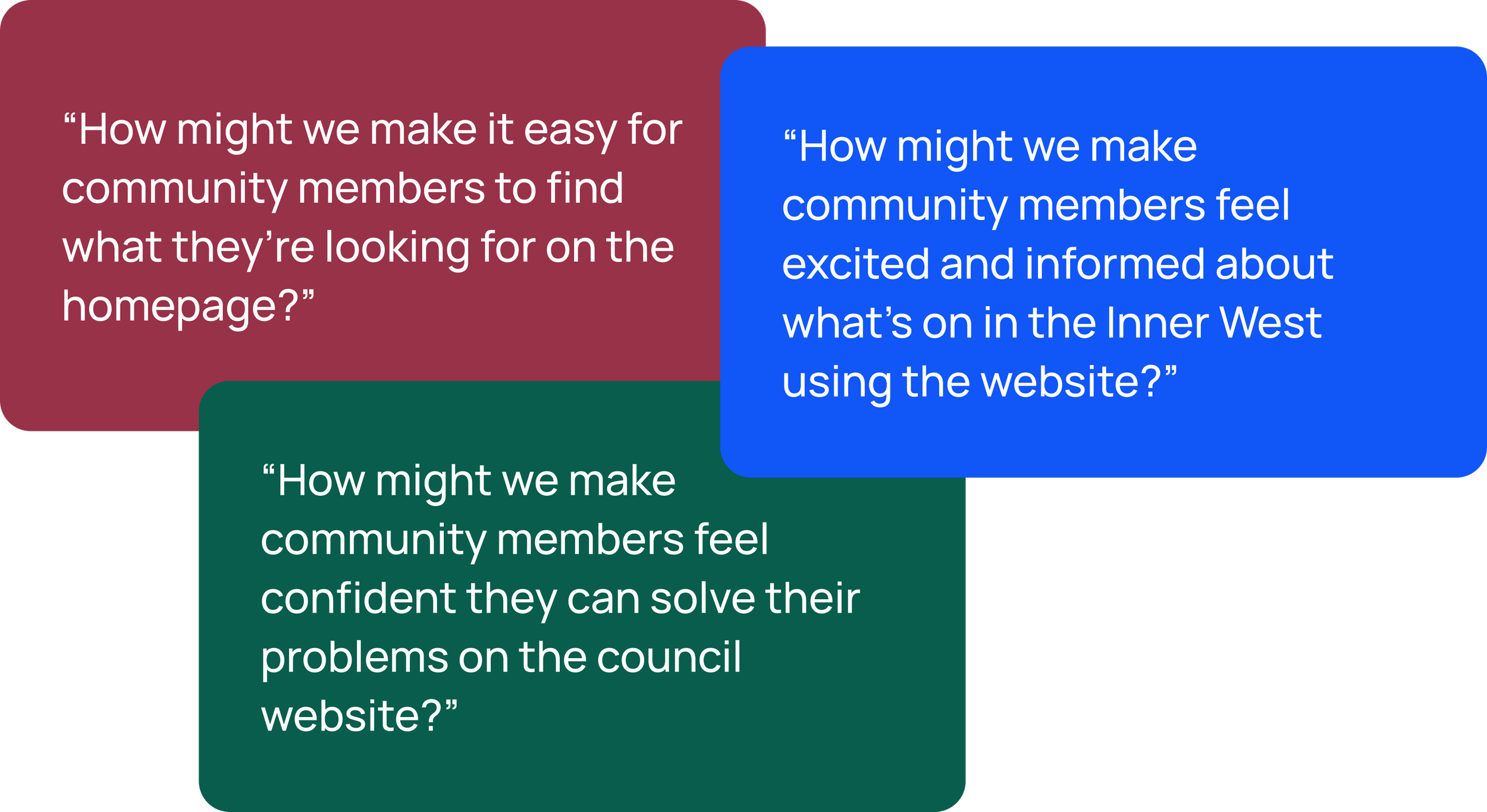
Using three focused “How might we” questions, the session highlighted recurring priorities across key parts of the site, particularly around clarity, relevance and ease of use. Rather than producing finished solutions, it helped identify where the design needed to respond more directly to real user needs and internal expectations
Outputs from the co-design workshop directly fed into the design. For example, responding to the HMW question about ‘What’s on’, several participants brainstormed ideas around location based personalisation:
Ward map with events visualising where things are”
Group by ward for What’s On
What’s on near me? There are a lot of events I find it overloaded
Be location based - shows what’s happening around you
Location targeted content. More personalised
This was something I believed could be achieved through simple geolocation on the homepage, so I wireframed a dynamic selector that would default to the users nearest ward, but allow the user to change their selection if needed. If the user didn’t have geolocation enabled, the selector would default to “Inner West” and show events from all wards.
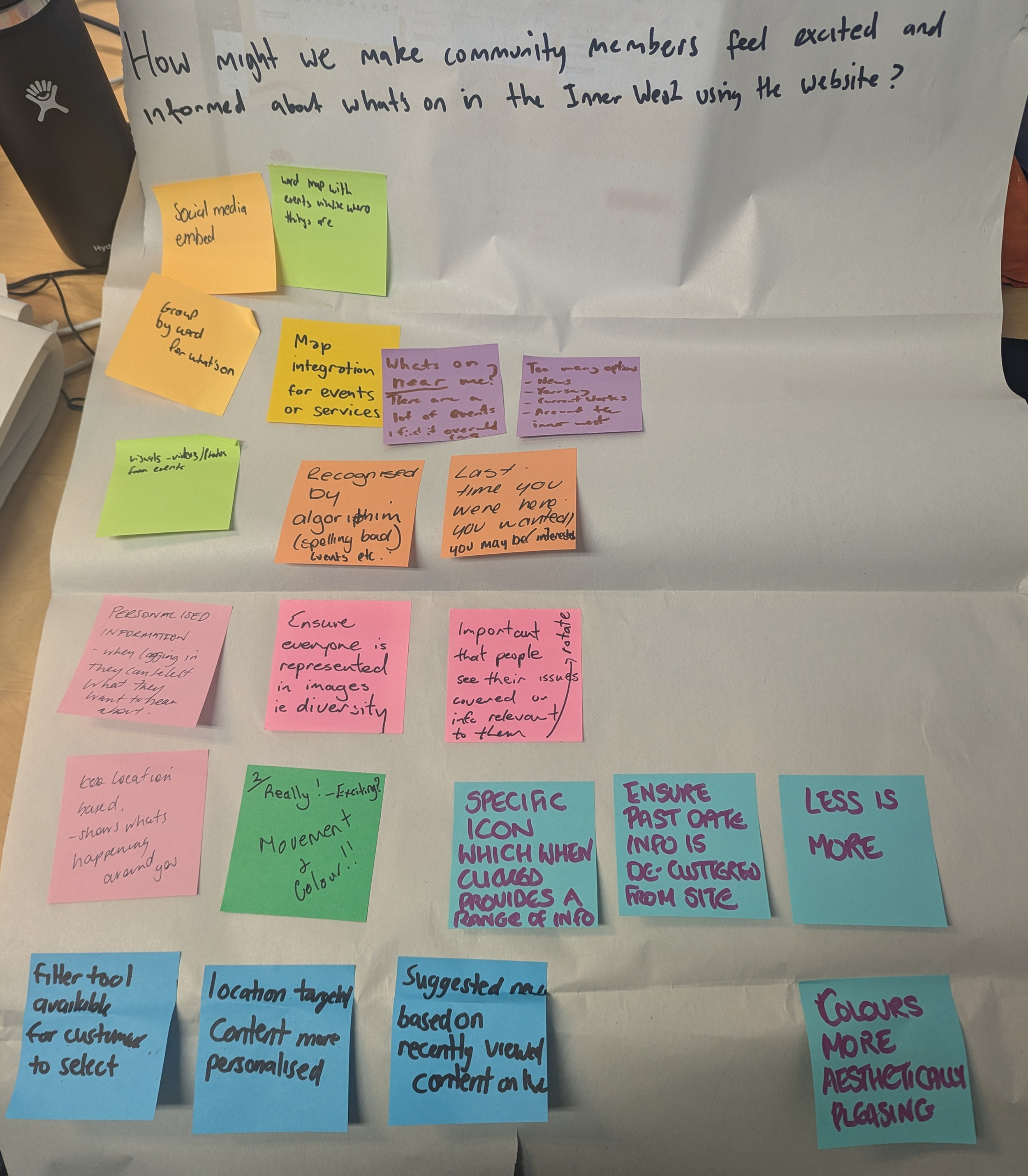
Output from the co-design workshop
A new homepage
A council homepage has to work for a wide mix of people. Some arrive with a clear task, like paying rates or reporting an issue, while others are looking for local news, events or consultations. It also has to balance internal needs, because different teams want space to promote their work. On the existing site, those priorities were competing with each other, and campaign led content often made it less clear where to start.
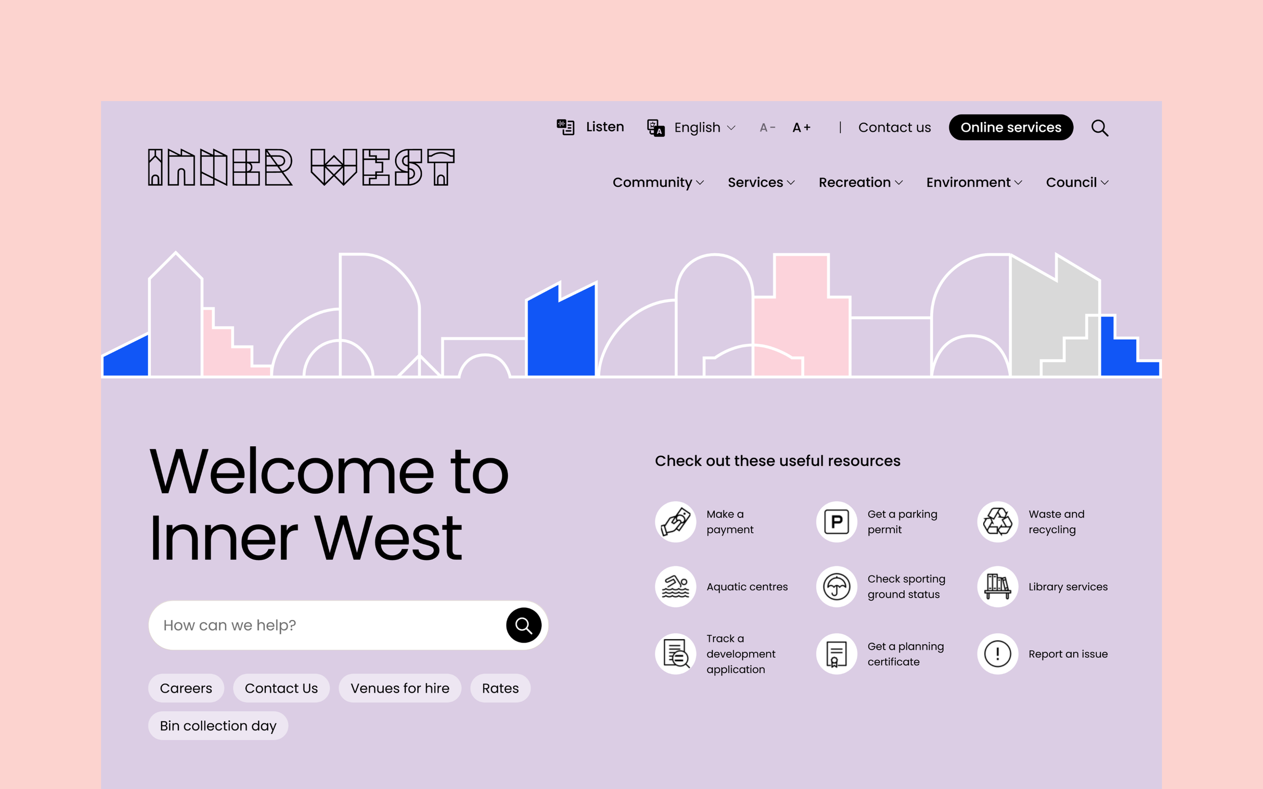
I restructured the homepage around clearer entry points and stronger content hierarchy. Search was brought to the top of the page, supported by popular and predictive suggestions, and high use services were surfaced immediately through a quick access grid. Alongside that, I introduced flexible modules for news, consultations and local events, including suburb based event discovery, so Council could keep the page current without overwhelming the core experience.
This created a homepage that better balanced public needs with internal publishing demands, helping people get to common tasks faster while still giving Council a practical and controlled way to highlight current priorities
Before
Old homepage with limited user pathways and flat design
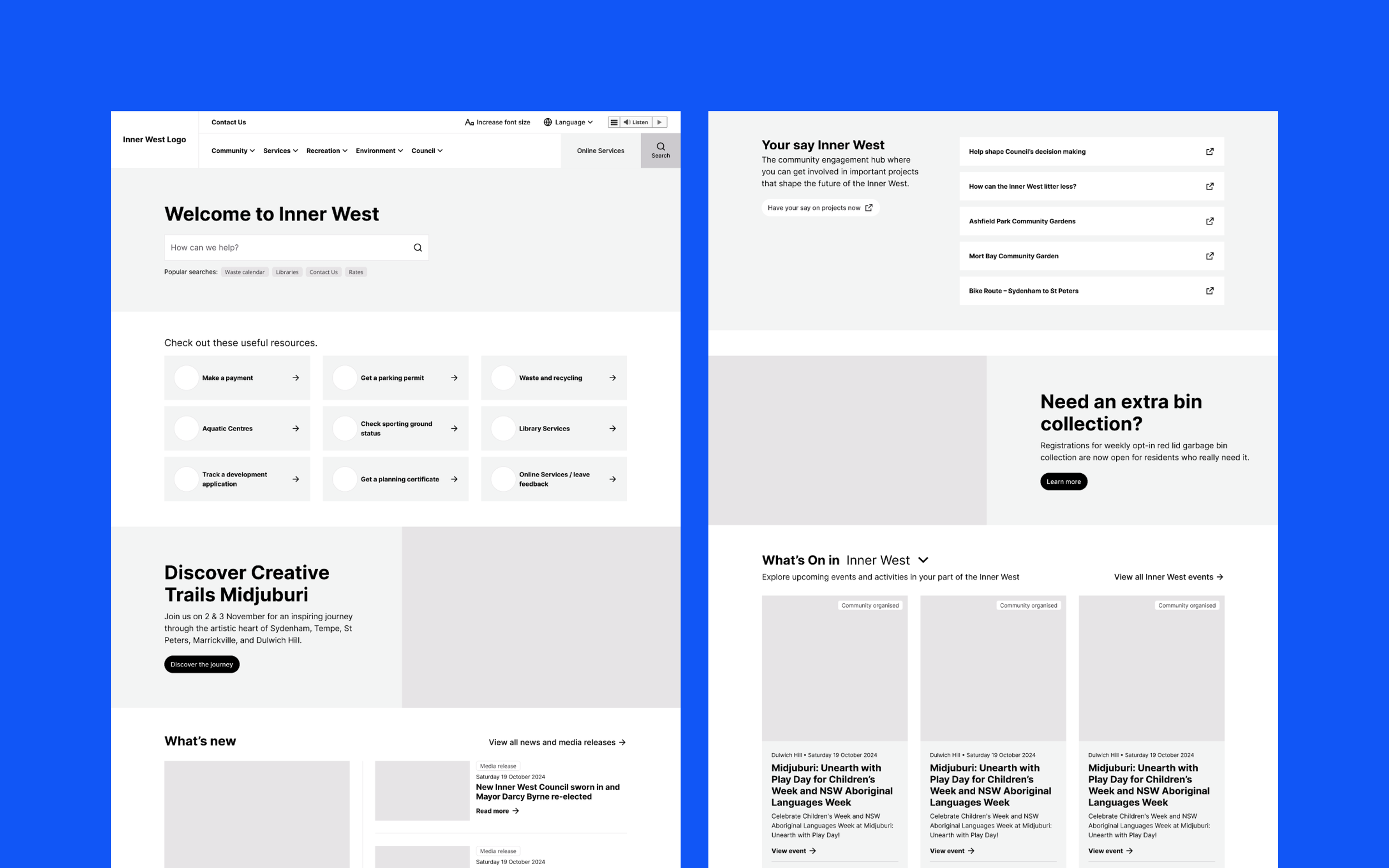
Homepage wireframes created the foundation for the design
After
New homepage with highlighted search and more entry points
Accessible and inclusive events
Events are one of Council’s most visible services, so I approached What’s On as a full journey: helping people browse, compare, decide and take action with confidence. Across the listing and event detail templates, I focused on making events easier to scan, filter and understand, with particular attention to accessibility and inclusion.
The existing experience made that harder than it needed to be. Browsing led users into a separate view all path with no filters, event cards gave very little information at a glance, and filtering was split across multiple controls. Event detail pages were also sparse, making it harder to judge whether an event was relevant, suitable or accessible.
I redesigned the experience to make event discovery clearer and easier to act on. The listing gave people better tools to narrow options and compare events quickly, while accessibility was made much more visible throughout the journey rather than buried in detail. On the event page itself, key information was surfaced earlier so users could understand what to expect, decide whether the event suited their needs, and move more confidently towards registration.
This created a more inclusive and usable events experience, helping people find relevant events faster and make better informed decisions.
Before
Old events experience complex filtering and overwhelming design
After
New events experience with accessibility baked in
Reducing content overload
A major issue on the existing site was content overload. Service pages often mixed key tasks, detailed guidance, secondary information and unrelated promotional content in ways that made them hard to scan and harder to act on. For users, that meant more effort to work out what mattered, what applied to them, and what to do next.
To address that, I developed a small set of core page templates that brought more structure and consistency to the bulk of the site. Rather than treating each page as a unique layout, the templates established clearer rules for hierarchy, task pathways and supporting content. Section landing pages helped users orient themselves quickly and reach common tasks faster, while detailed content pages created a more focused reading experience with better separation between primary information, useful supporting content and onward pathways.
From a UX perspective, the value was in reducing friction. By giving repeatable content a clearer structure, the templates helped turn information heavy pages into more focused task pathways, directly supporting the brief’s goals around findability, accessibility and task completion.
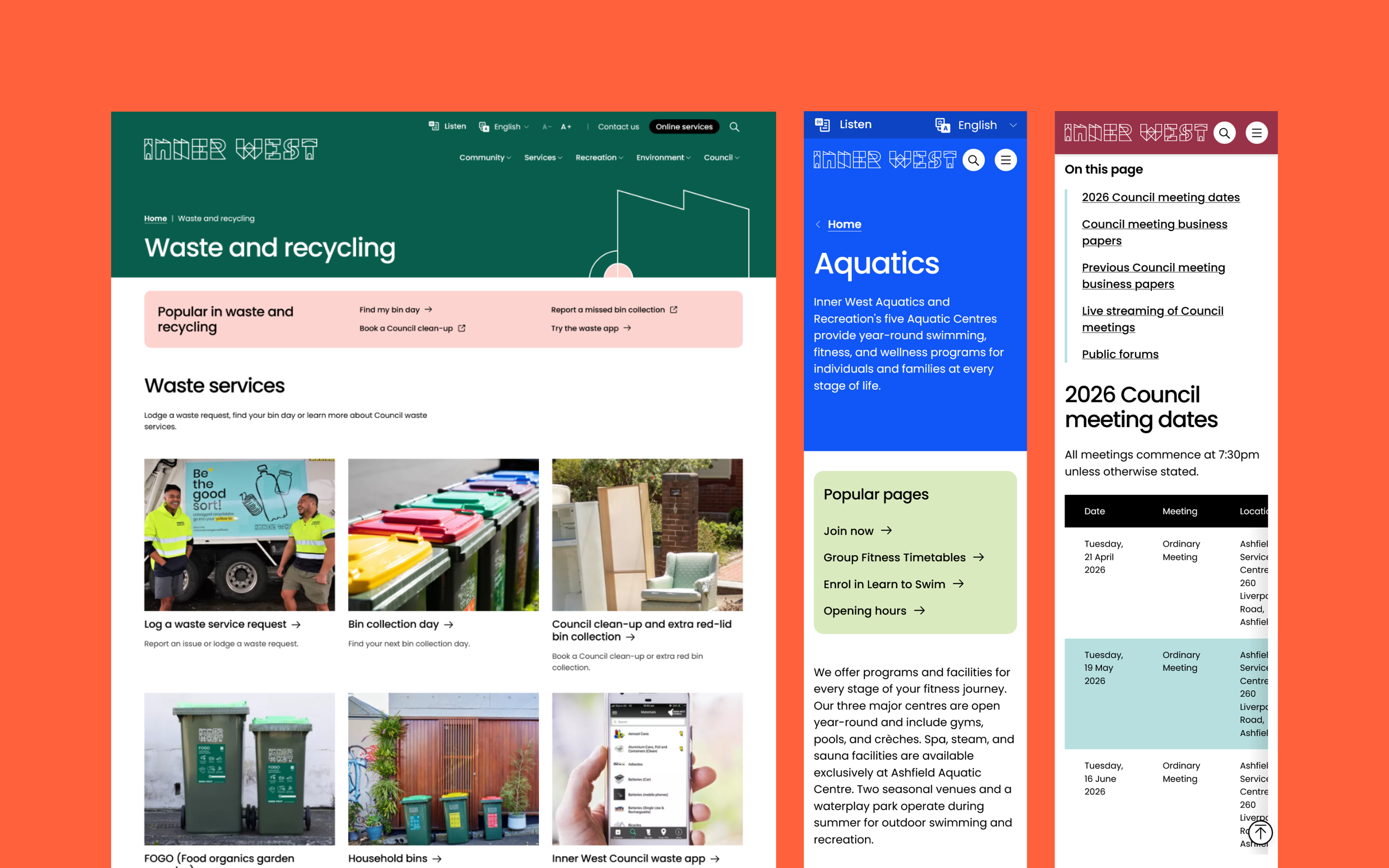
Before
Old content pages were overwhelming and lacked hierarchy
After
New content pages have focus and better facilitate task completion
Bridging design and build
A lot of UX risk sits in the handover between design and development. Without clear functional guidance, important behaviours can be left open to interpretation, especially across complex templates, filtering patterns and CMS driven content.
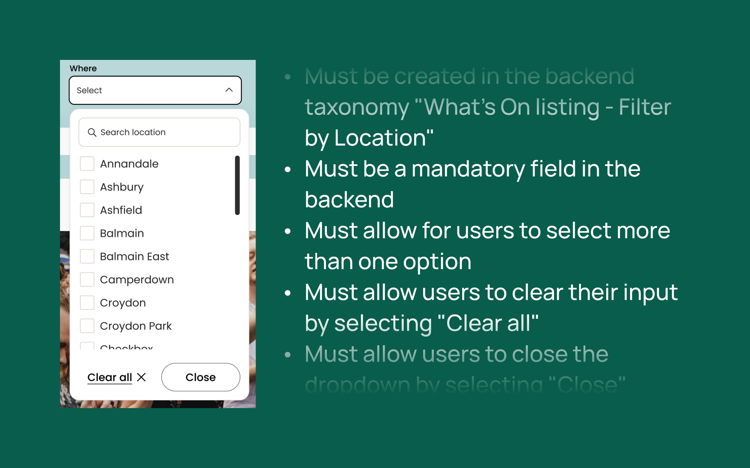
I produced a detailed functional specification that translated the approved designs into practical build requirements. Structured as a working spreadsheet, it gave Council and developers a shared reference point across the full set of templates and global elements, including navigation, search, homepage, flexible content pages, events, maps, news and media.
The value of the spec was in the level of clarity. It documented how components should behave, what users would see when interacting with them, the rules and dependencies behind different states, and the CMS considerations needed to keep templates flexible for content authors. It also carried key accessibility requirements into implementation, helping protect important details such as link behaviour, file labelling and accessible interface decisions.
Outcomes and reflection
Inner West Council’s website had become complex and inconsistent over time, with the homepage especially stretched by competing internal priorities. The redesign brought greater clarity to that experience through a validated information architecture and a set of repeatable templates and journeys that made common tasks easier to find and complete.
One of the strongest lessons for me was how much digital inclusion improves when accessibility is treated as part of the core experience, rather than something checked at the end. We made accessibility more visible within everyday journeys such as events and Near me, helping people understand their options and make decisions more confidently. The co-design process was also especially valuable, both in surfacing practical ideas and in building shared ownership of the direction across Council.
Council was extremely pleased with the outcome, and after going to market for the next phase, awarded us the additional development project as well.