Ironbark Financial Group
Ironbark is an Australian financial services group spanning advice, private wealth and investment solutions brands. This project centered on unifying these brands into a group wide website showcasing services, products and proposition.
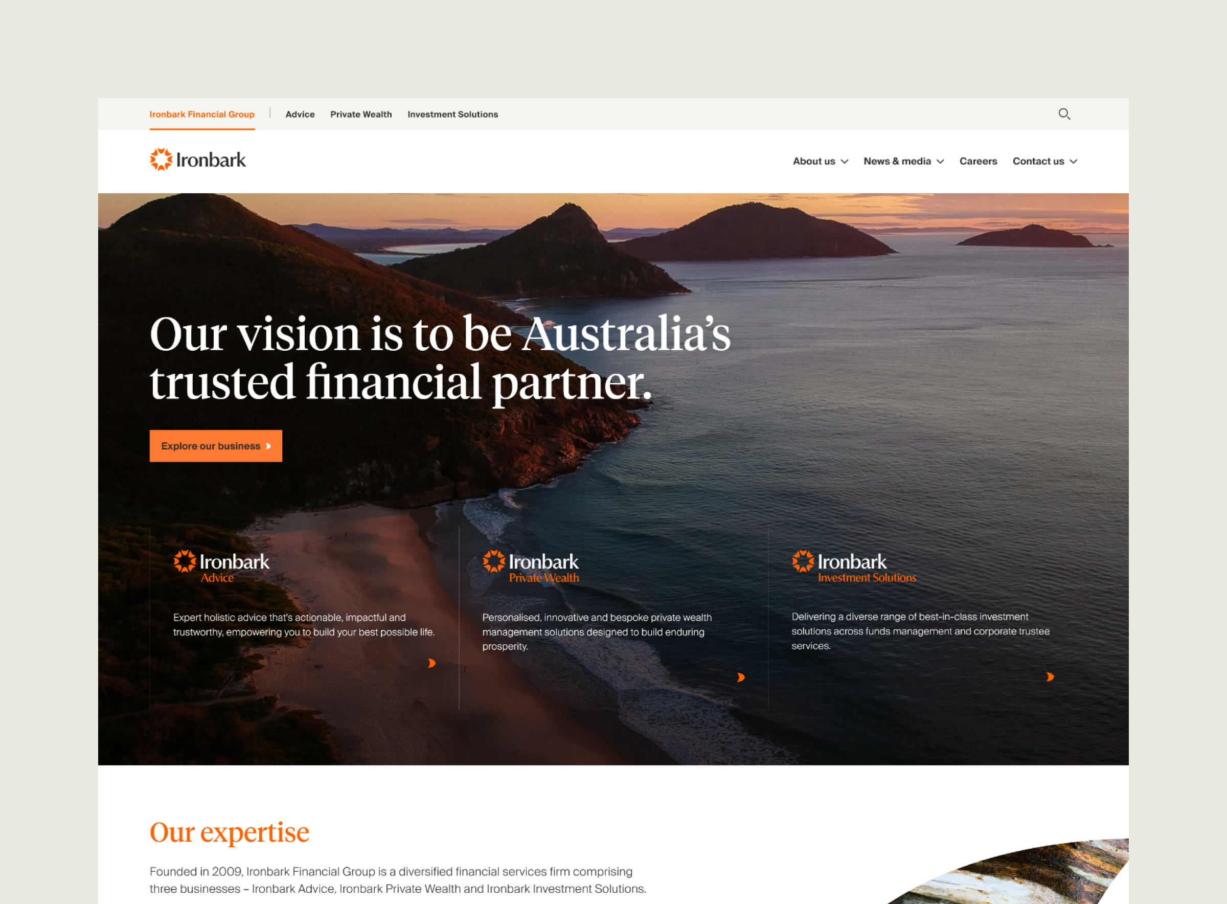
The problem space
Ironbark was bringing together multiple businesses under a new masterbrand and needed a website that could do more than present a unified brand. It needed to clearly guide different audience types, build trust in the broader group, support lead generation for Advice, and make it easier for users to access services, fund information and important documents.
The core challenge was to turn a complex ecosystem of more than 10 existing websites into one connected experience without flattening the distinct needs of each part of the business. Each brand had its own stakeholders, priorities and ideas about how users should move through the site, so navigation and information architecture became central to resolving that complexity. The solution needed to support both consumer focused journeys, like finding a financial adviser, and more complex fund management and trustee related flows within one coherent structure.
Scope
Discovery • Information Architecture • Co-design • Wireframing • UI Design
My role
I was the UX Lead for the Ironbark website project, leading the experience from discovery through to UI.
I worked closely with the project manager, UI designer and client team to shape the UX approach, information architecture and wireframes. I also supported interface design and content refinement across the site.
Early learning
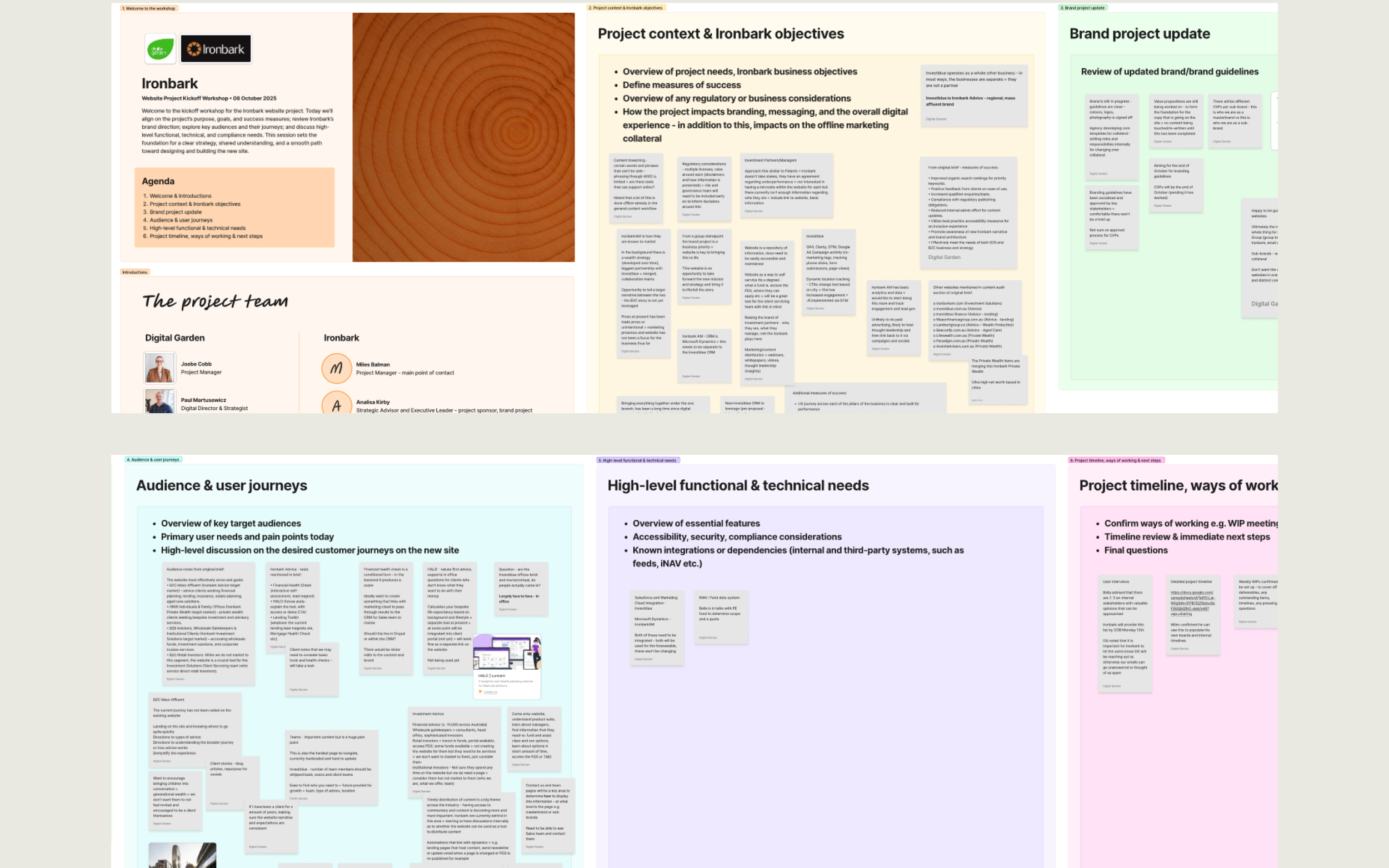
I led an in person kickoff workshop with senior stakeholders from across Ironbark’s three businesses. It helped build a clearer picture of the group’s structure, the audiences each business served, and how those businesses related to each other within the future website experience.
The session also surfaced the priorities each area brought to the project. Advice focused on lead generation, education, contact pathways and retaining location based features. Private Wealth emphasised trust, discretion and a more relationship led experience. Investment Solutions prioritised fund information, document access, disclosures and investor specific pathways.
It also became clear that many users would arrive through search, referrals or shared links, which made strong landing pages and flexible navigation an important part of the solution.
This gave me a clearer basis for the upcoming stakeholder interviews and left me with direction on the types of questions and topics I would cover in them.
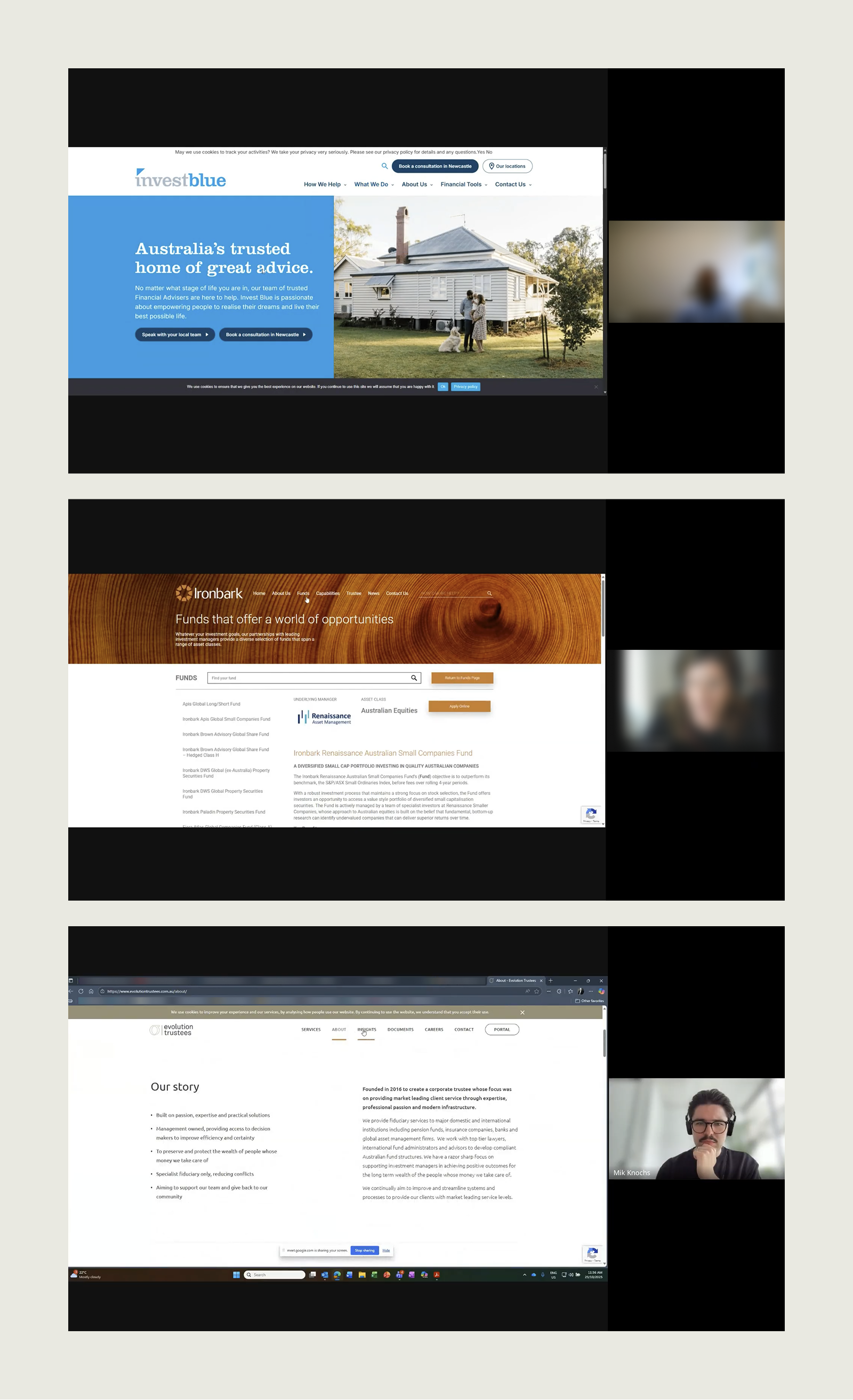
Unique needs for each business
I led stakeholder research across Ironbark’s three businesses to understand audience needs, current pain points and the priorities shaping the new site. The findings helped define the site structure, content model and key templates, turning broad business requirements into a clearer UX direction.
Advice needed to work as a strong first experience for prospective clients. This pointed to plain language, low friction pathways, and clear supporting information such as adviser profiles, locations, fees and contact options.
Private Wealth needed a more compact and discreet presence. Its role was less about direct conversion and more about building trust, which shaped a more polished and restrained approach to content and hierarchy.
Investment Solutions needed to function more like a workspace for professionals, with faster access to fund information, documents and servicing content. This led to a more unified fund page model and clearer treatment of trustee and compliance related content.
Interviews were also valuable for understanding the tone audiences resonate with. For example, Private Wealth clients expect an elegant, refined style whereas Advice clients need to see themselves in the website through imagery.
Designing the navigation model
The information architecture needed to consolidate several existing websites into one connected structure, while still giving Ironbark’s three business pillars enough distinction to support their own audiences, services and compliance needs.
One of the main design questions was how group level content and purchase brand content should work together in navigation. Early on, I explored different models for this, including approaches where the broader group remained more prominent throughout the site. The direction that proved strongest was a simpler model where the primary navigation reflected the active brand, with group content sitting alongside it more selectively. This aligned with the research, which showed that most users were trying to complete a task within one part of the business rather than move across the wider group.
To keep the experience connected, I introduced a tertiary brand selector that let users move between brands without overloading the main navigation. This also created a clearer role for brand cues in the interface, helping users stay oriented as they moved through different parts of the site.
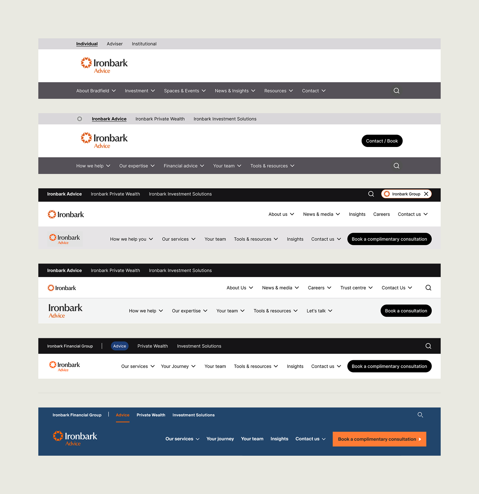
Evolution of navigation and IA for the Advice brand from wireframes to UI
Validating the structure
I used tree testing to validate the draft IA and identify where labels or pathways still needed refinement. Across 11 priority tasks, the tree achieved a 74% success rate against an 80% target, giving a useful measure of where the structure was working and where it needed adjustment.
Most tasks performed well, which gave me confidence that the broader architecture was on the right track. The test was run with internal stakeholders rather than external users, so the results were more directional than definitive, but still valuable for identifying weaker labels and pathways before finalising the structure.
The weaker tasks pointed to more localised issues with wording and signposting. Retirement planning underperformed because How we help and Our expertise felt too similar, while Aged Care Advice did not match how participants interpreted the task. Philanthropy and office locations also exposed ambiguity across Private Wealth, Advice and group pathways.
I used these findings to refine the next IA iteration, tightening service labels, clarifying contact and location pathways, improving careers cross linking from group content, and reconsidering the role of the proposed Trust Centre. The testing gave me confidence that the structure itself was sound, and that a focused set of refinements would strengthen it further.
Snippets from tree testing outputs
Shaping the core brand
The group homepage needed to introduce Ironbark as a credible new masterbrand and help users quickly understand where to go next. At the same time, it had to reflect the structure of the organisation and support movement into each purchase brand.
I shaped the wireframes around orientation and credibility. The opening section established the group proposition and presented the three business pillars as the clearest entry points into the site. Supporting sections then built trust through proof points, insights, team content and careers, while the footer carried the broader group structure and surfaced important compliance information.
That structure gave the UI a strong foundation. Working closely with the UI designer, I helped refine the emerging visual direction through typography, colour and brand motif, shaping a restrained group identity that could act as the backbone for the wider site
Wireframes were created to align on page requirements and hierarchy
Group level homepage focused on brand story and key user journeys
Fund listing wireframe showing card and tab functionality
Fund detail wireframe showing all-in-one page with sticky navigation
Before and after
Old fund experience with rudimentary functionality
Designing a clearer fund journey
The funds section was one of the more complex parts of the project, with a large set of client requirements and a clear need to improve how advisers and investors find information quickly.
Research showed that many users were coming to Investment Solutions with a defined task, such as checking performance, finding a PDS or comparing fund information. Stakeholders also wanted the experience to feel more efficient than the existing site, where key information and documents were spread across tabs, accordions and multiple pages. In response, I designed the fund journey around fast access, clearer comparison and more structured page models.
For the fund listing page, that meant making key information available earlier in the journey rather than forcing users into every detail page. I designed a tabbed card pattern that let users reveal performance context, platform availability and core documents such as the PDS directly within the listing. Asset class filtering made the directory easier to narrow down, supporting quicker scanning and comparison.
For the fund detail page, the goal was to consolidate a large amount of structured information into one clearer experience. I introduced a sticky in page navigation, a clear investment CTA, and a variant selector for funds with multiple classes or hedging options. This brought fund facts, pricing and distributions, performance, resources and application pathways into a single structured page, reducing unnecessary back and forth and making the page more useful as a practical working destination.
The final UI stayed closely aligned to the wireframe model, which helped carry the underlying UX thinking through into the finished design.
New fund experience with improved structure and information hierarchy
A new location experience
The locations experience needed to do more than list office addresses. The brief called for interactive maps, office information and contact pathways that could support different audience types across the group. Advice also had a much larger regional footprint and a stronger conversion role than the other parts of the business, so the design needed to support both discovery and action.
In response, I split the solution into two connected patterns: a broader group locations page and a more tailored Advice focused listing. This gave Advice’s office network the prominence it needed, while still supporting head office, Private Wealth and Investment Solutions within the wider group structure. It also aligned more closely with the different jobs these pages needed to do, from helping prospective advice clients find a nearby office to giving other audiences a clearer route to the right team or contact point.
The design used familiar map and card patterns so users could search by suburb or address, filter by business area, and move easily between the list and map. Shared offices and pre filtered entry points from within each purchase brand were also built into the model, reducing the amount of work users had to do to reach the right office, team or contact details. I then carried this structure through into the UI, helping shape how the map, cards and filtering patterns were expressed visually.
Before and after - Advice
Invest Blue’s barebones location page
Wireframes showing Ironbarks national presence
Ironbark Advice version of the map listing
Core pages and content
Flexible landing pages and service templates became the backbone of the new site. They needed to do more than introduce content. They had to explain services clearly, support credibility, create pathways into deeper content, and give the client a reusable publishing system that could scale across Drupal.
I designed a shared template framework that could work across the group while still adapting to the needs of each business. Consistent layout logic gave the site structure and reuse, while imagery, typography, statistics, card based pathways and split content sections helped pages feel more engaging and purposeful. This made the templates suitable for a wide range of use cases, from higher level landing pages through to more specific service content.
Brand theming was a key part of the solution. Each purchase brand had its own colour palette and visual cues, so I designed the system to carry those differences consistently through the templates. That meant the same underlying page model could feel distinctly Advice, Private Wealth or Investment Solutions without needing to be redesigned each time.
I also supported content refinement and population, helping ensure the final pages worked as a practical and scalable content system rather than a set of static mockups.
Outcomes and reflection
A major challenge in the Ironbark project was designing for a business bringing multiple brands, audiences and service types into one connected website. The navigation had to support the broader group structure, while still helping users get to the right service, person or information quickly. Balancing that group narrative with clear, pillar specific pathways became one of the core UX challenges of the project.
The work also required getting across a very wide range of business needs, from Advice and Private Wealth through to the more complex fund management and compliance requirements within Investment Solutions. For me, that was one of the most valuable parts of the project. It reinforced that good UX in a multi business environment depends on taking the time to properly understand how each part of the organisation works, then designing a system that can hold those differences together.