Energy Consumers Australia
Energy Consumers Australia (ECA) is the national voice for residential and small business energy consumers, with a website that champions it’s advocacy, research and grant content
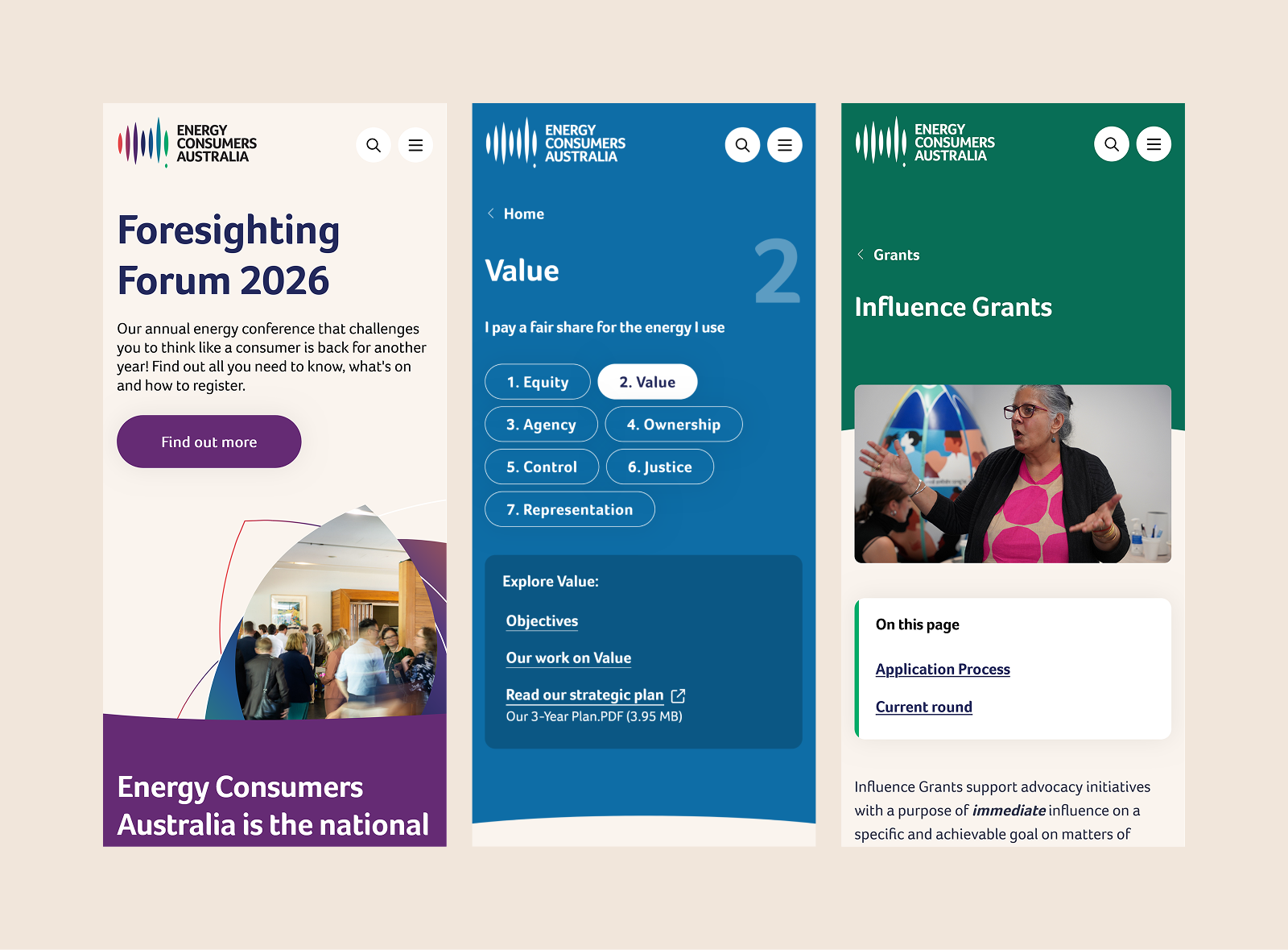
The problem space
Energy Consumers Australia (ECA) is the national voice for residential and small business energy consumers, advocating for an energy system that works for all Australians.
Its website is a key public platform for policy advocacy, research, grants and consumer guidance, serving audiences ranging from governments and market bodies to grant seekers, businesses and households.
The existing site was fragmented across microsites, with inconsistent branding, weak navigation and limited accessibility, making it difficult for users to find information, understand ECA’s role, or engage with its work confidently. The redesign focused on creating a more unified and trustworthy digital presence, with clearer audience pathways, stronger search and content findability, accessible design, better integration of ECA’s seven target strategy, and a more effective grants and research experience.
Scope
Discovery • Co-design • Information Architecture • Wireframing • Usability Testing
My role
I led UX strategy within a cross functional team of a project manager, UI designer and developers. I owned the end to end discovery and validation process, including conducting stakeholder interviews, facilitating a co-design workshop, defining the audience model and information architecture, producing wireframes and overseeing usability testing.
I translated research insights into clear design decisions, presented recommendations to senior stakeholders and ensured the evolving solution aligned with ECA’s strategic goals and accessibility requirements.
Setting the direction
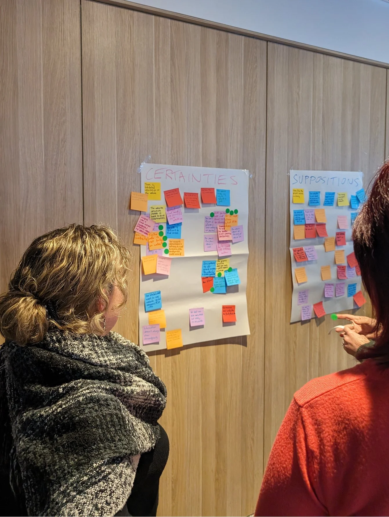
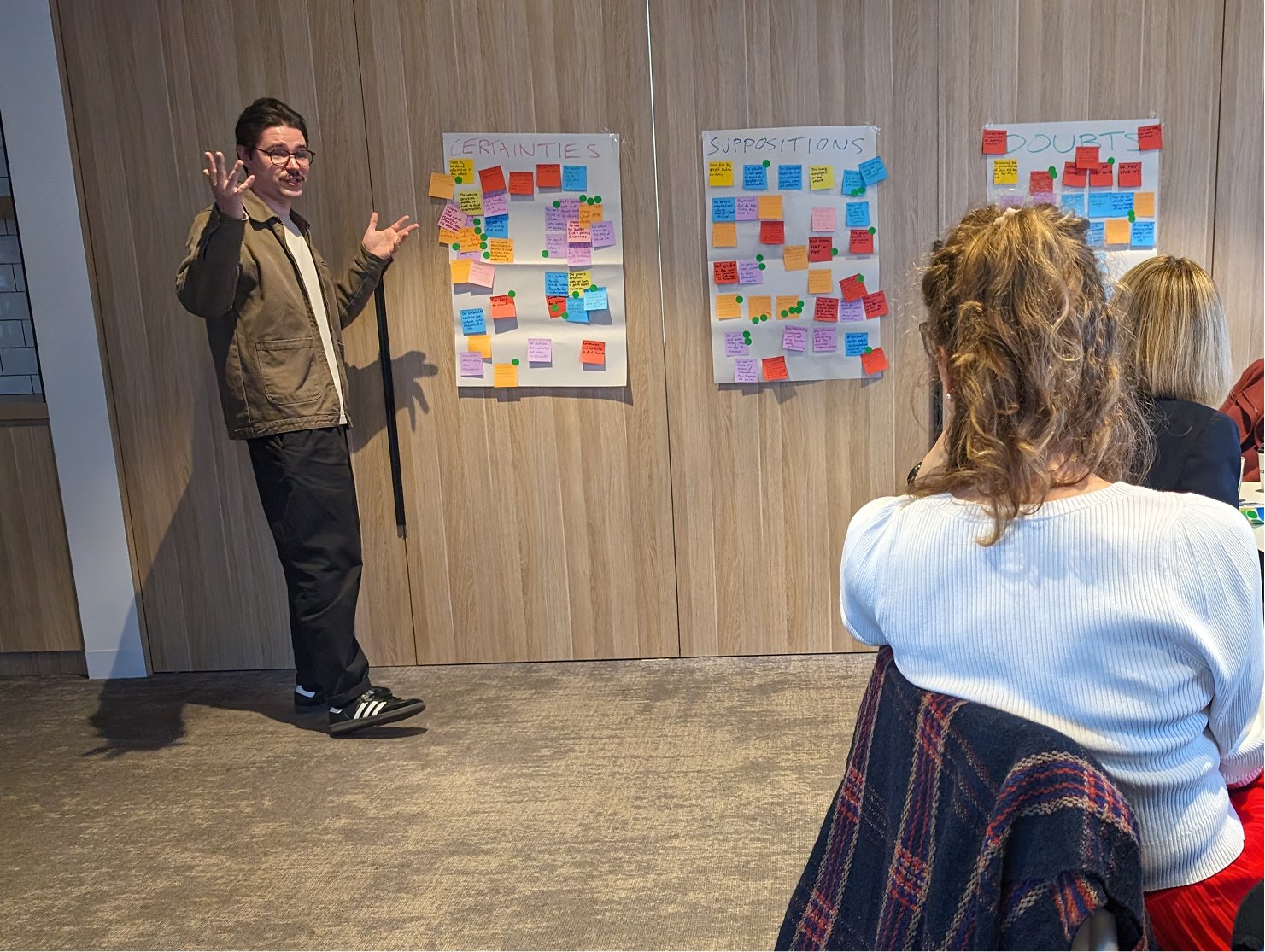
I facilitated a half day kickoff workshop at ECA’s office to align the project team around what the new site needed to achieve. Using activities such as stakeholder mapping, a CSD matrix and an early navigation card sort, I helped turn assumptions into a clearer strategic direction for the redesign.
The session clarified several important shifts. ECA needed to communicate its purpose and policy position more clearly, create more distinct pathways for decision makers and consumers, and improve findability across publications, survey data and grants.
The workshop also surfaced practical constraints, including legacy technology and limited resourcing, which reinforced the need for scalable templates, stronger taxonomy and a site structure that could support ECA’s move from a static document repository to a more active advocacy platform.
Perspectives from the industry
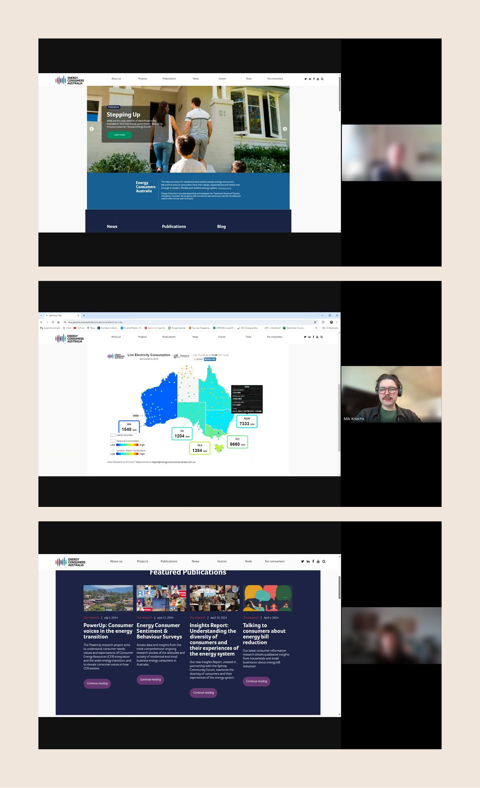
I led the stakeholder research program for the ECA website, conducting semi structured interviews across ten key audience groups including government advisers, market bodies, utility executives, consumer advocacy leaders and grant applicants. This gave the team a clearer view of how different audiences used the site, what they valued, and where the existing experience was creating friction.
Key findings included:
Industry stakeholders generally understood ECA’s advocacy role, while non industry users often found its purpose unclear.
Most people visited the site infrequently and with a specific task in mind, such as downloading survey data, reading publications or accessing grants, which made clarity and findability especially important.
Survey data was regularly downloaded for offline use, reinforcing the need for concise summaries and faster access to key insights.
The Grants Archive emerged as a critical journey, with clearer status information and supporting documentation needed to help applicants assess relevance.
Publications were highly valued, yet search and filtering tools were often overlooked because they were hard to find or inconsistent.
These findings directly informed the information architecture, navigation and content hierarchy, strengthening the case for clearer audience pathways, better search and taxonomy, improved grant visibility, and a more explicit articulation of ECA’s role and impact.
Shaping ideas
I facilitated a three hour co-design workshop with ECA’s core team to turn research findings into practical design directions.
I structured the session around “How might we” prompts drawn directly from stakeholder research, then used blue sky ideation and a Crazy 8s sketching sprint to help the team move from broad challenges to more concrete solutions. Keeping the activities low fidelity and highly structured made it easier for a mixed group of participants to contribute, while still producing input that was specific enough to guide design.
Key themes that emerged included:
The homepage needed to explain ECA’s role much faster and make it more obvious who the organisation serves.
Navigation needed to use plainer language and create clearer pathways for consumers, advocates, researchers and policy stakeholders.
Users needed better signposting to trusted external services where ECA was not the right point of assistance.
ECA’s advocacy, campaigns and policy priorities needed to be surfaced more clearly through the site.
Research and submissions needed to move away from long document heavy pages toward concise summaries, structured listings and topic based filtering.
A focused homepage
The homepage was redesigned to give ECA a more contemporary, strategic front door while making its purpose easier to grasp.
A key improvement was the introduction of ECA’s seven energy targets as a clear visual device, helping connect the organisation’s advocacy work to a more tangible set of priorities.
The design also created a stronger hierarchy across the page, with flexible space for campaigns, policy work and news, while clearer content cards and metadata made key updates easier to scan. More visible pathways for consumers and small businesses helped round out the homepage, giving different audiences a clearer starting point without losing ECA’s broader advocacy focus.
Before
Old homepage with weaker visual hierarchy and limited audience pathways
Wireframes for the new homepage
After
New homepage shaped around 7 targets, with clearer hierarchy and pathways
Grants overhaul
The grants section of the website was overhauled, including merging the external grants archive into the main site. This improved the user journey and allowed applicants to more easily understand the types of grants awarded, improving their own application approach.
I created a rich search and filtering system to reflect the existing data structure of the grants archive. Cards were designed to show information at a glance, reducing the need to constantly click into and out of detail pages. Following feedback in the interviews, I designed a download system that allows users to access raw CSV data from the whole grants archive, including a separate filtered download, matching any applied filters.
Participants in the interviews and co-design workshop emphasised the need to showcase real world outcomes of grants, so I structured the detail page to include a distinct “Impact” area and give CMS users the ability to pull through relevant case studies. This closed the loop of the whole grant lifecycle and aimed to improve the quality of grant applications.
Before
Old grants section with limited functionality and external grants archive
After
New grant flow with improved structure and robust filtering system for the archive
New consumer hubs
Research and stakeholder interviews confirmed that that consumer facing content was sprawled across multiple pages with an overly simple landing page offering little engagement.
Households and small business are not ECA’s primary audience, but the site needed to ensure their questions could be answered and the expectation was set around what ECA can and can’t do for household consumers.
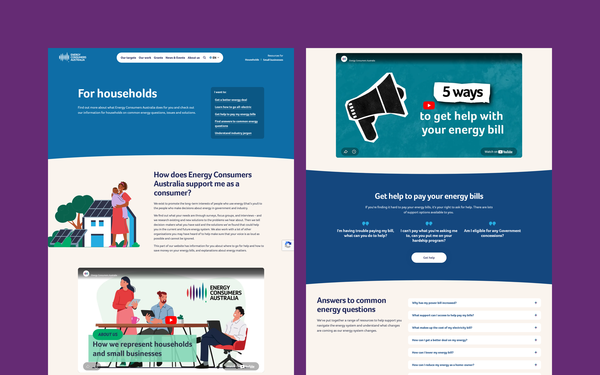
I designed the new consumer hub to be a more guided and engaging experience, using a campaign style layout to surface key consumer guidance offered by ECA. This included sections like '“getting a better energy deal”, “understanding industry jargon” and links to practical advice.
The direction focused on simple and friendly content so that users of any energy literacy could follow. For example, displaying large quotes from the “Get help from your provider” script that consumers can use when calling their energy provider.
The design also included flexible components so ECA can continue to update the hub in the future.
Wireframes for the new consumer hubs
Wireframes for the research and content pages
Making research easier to use
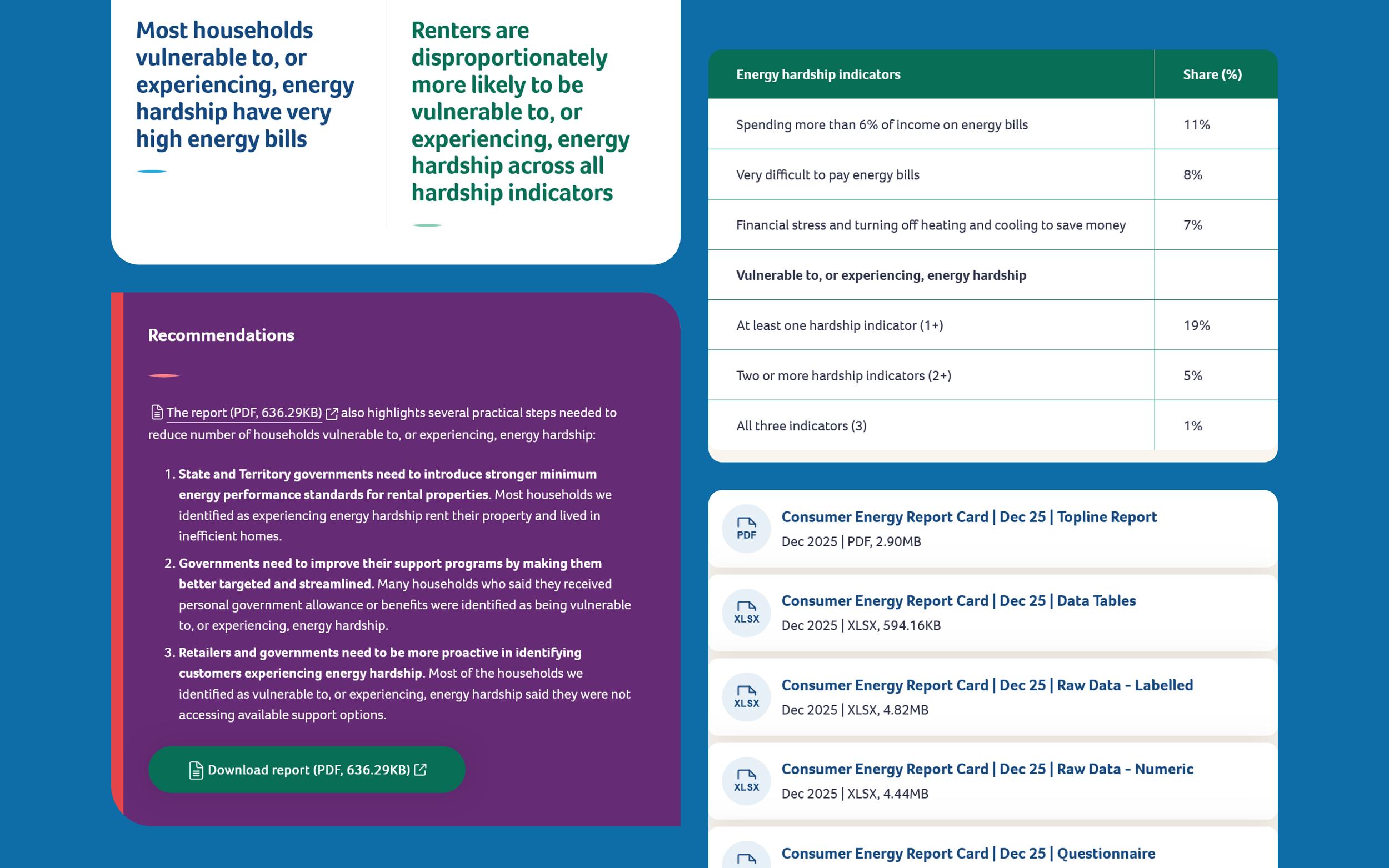
Research and content templates were redesigned to better support ECA’s core outputs including surveys, submissions and policy reports. The designs had to support both normal website readers and power users.
Normal readers wanted to get a snapshot of findings, so I introduced some flexible call-out components and light data visualisations to enable ECA to create more engaging content and prevent readers from having to download PDF’s or CSV files. Highlighted recommendations and insights blocks were also added to help structure the page.
Power users however still wanted access to data files to manipulate it for their own needs, so I ensured a right hand column was always reserved for supporting downloads or metadata. This created a consistent layout across these templates that caters to two distinct user types.
Validating the experience
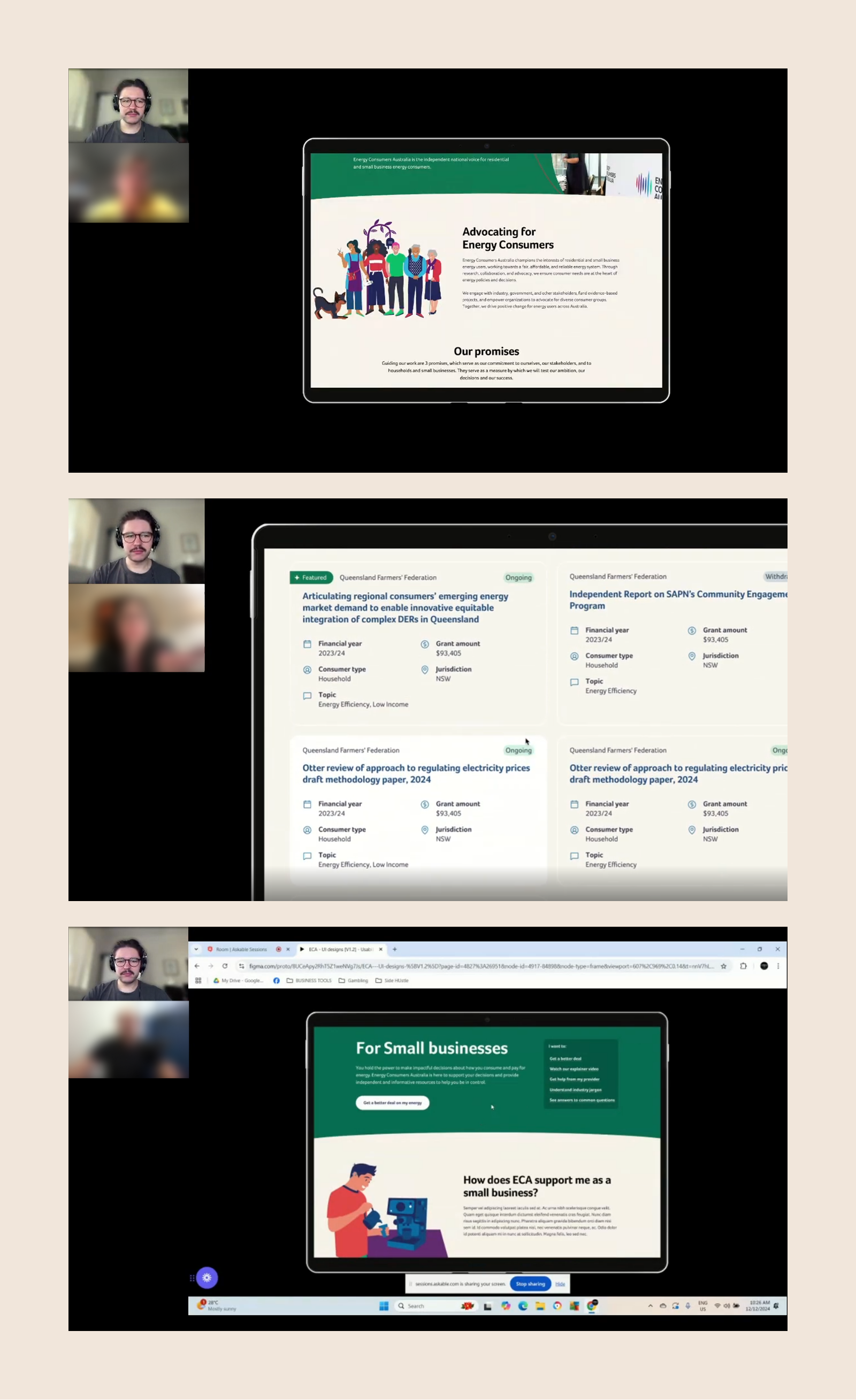
I planned and moderated remote usability testing on the interactive prototype with five small business owners recruited through Askable. The sessions covered key journeys including homepage comprehension, navigation, grants, target listings, the Consumer Hub and search, helping validate both the overall structure and the clarity of important content.
The testing showed that the core experience was working well. Participants generally found the site clean, trustworthy and easy to navigate, with the mega menu, filters and search all supporting content discovery effectively. The main issues were around clarity rather than structure. Some users did not immediately understand ECA’s role from the homepage, technical language such as “jurisdiction” created friction, and parts of the grants and Consumer Hub journeys needed stronger emphasis or clearer framing.
This led to a focused round of refinements, including clearer homepage messaging, simpler consumer facing language, improved grants visibility, a stronger help pathway within the Consumer Hub, and better context on target listing pages.
Outcomes & Reflections
This project challenged me to translate a policy heavy and advocacy driven organisation into a digital experience that works for both industry stakeholders and everyday consumers.
The redesign consolidated fragmented microsites into a unified platform and established a scalable set of templates and components that enabled internal teams to publish more consistent and engaging content.
Not all early ideas carried through - usability testing showed that clarity and hierarchy consistently outperformed more expressive or decorative approaches.
By anchoring decisions in research, we delivered a structured, scalable platform that improves mission clarity, grants visibility and content findability.
The project reinforced the value in running a comprehensive research program and engaging stakeholders directly. Findings from research and co-design directly informed the UX thinking and functionality which led to a better outcome.