National Library of Australia
The National Library of Australia (NLA) is the country’s leading library, preserving and providing access to Australia’s cultural and documentary heritage. Its website is the main public gateway to its collections, services and research tools.
The problem space
The National Library of Australia’s website is the main public gateway to its collections, services and research tools, but the existing experience had become dated and no longer reflected the needs of its broad audience.
As the Library’s digital front door, it needed to do more to guide people to the right content, surface the depth of the collection, and support clearer pathways across a large and complex information environment.
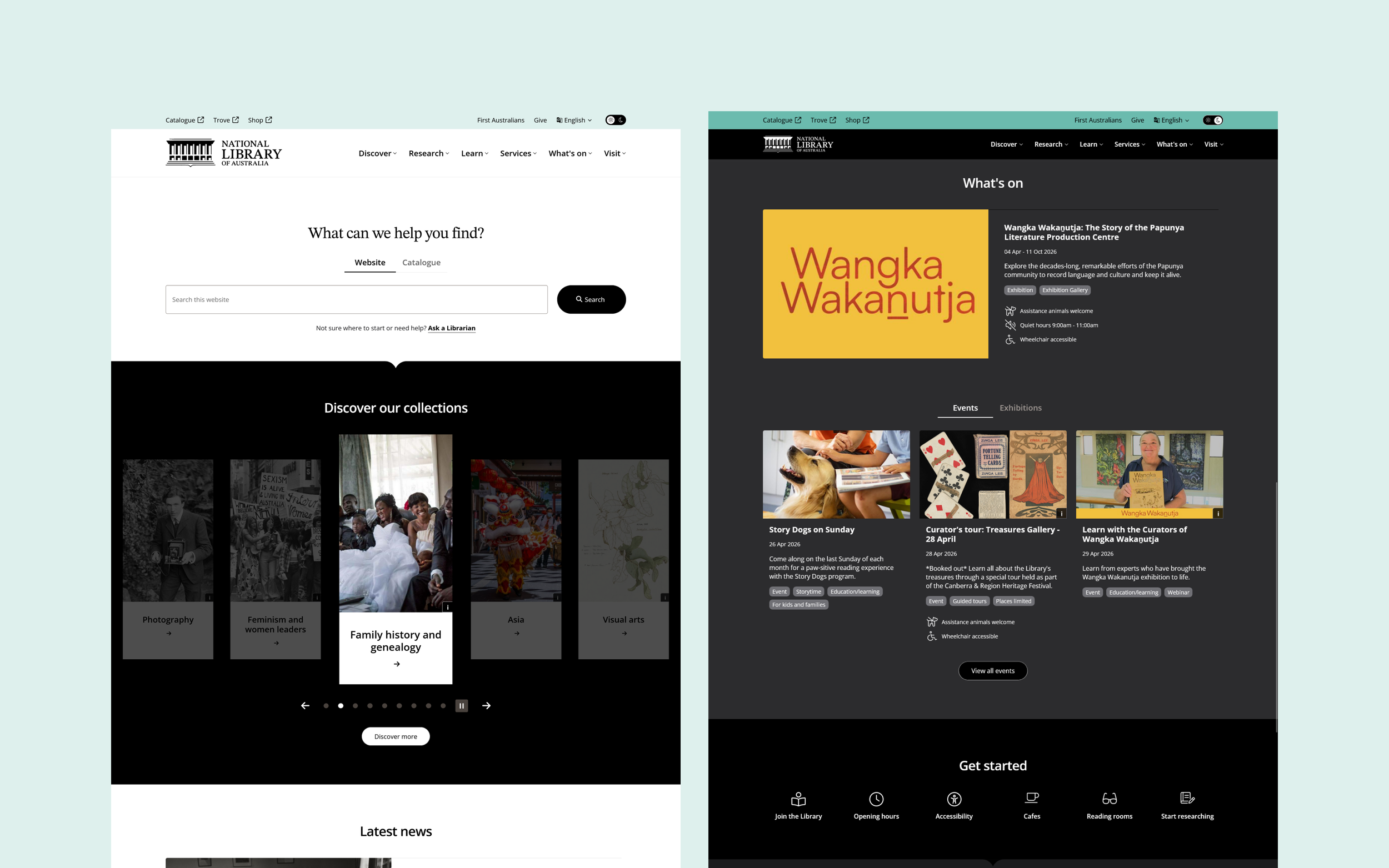
The redesign focused on creating a more modern, audience centred experience that improved discoverability, strengthened accessibility, and made the site easier to use across devices. It also needed to establish a reusable design system that could bring greater consistency across Library branded digital products, while reducing internal effort through clearer standards, reusable components, and more efficient CMS structures.
Alongside the website redesign, the project needed to meet WCAG 2.1 AA and the Australian Government Digital Service Standard, while creating a flexible foundation for a wide range of content types and user journeys. The goal was to turn a complex and outdated website into a clearer, more cohesive experience that better connected people with the Library’s content and services.
Scope
Discovery • Wireframing • Usability Testing • Design System
My role
I was the lead UX designer on the project, working alongside a Digital Strategist, Project Manager, UI designer and developers.
I led the UX approach across the redesign, including wireframing, usability testing and design system strategy. I worked closely with the wider team to make sure the experience stayed aligned with prior research, accessibility requirements and the Australian Government’s digital service standards.
Throughout the project, I produced and presented key UX deliverables and reports to client stakeholders, helping guide decisions as the work evolved from early concepts through to a more resolved design direction.
Early alignment
The client had already completed a substantial first phase with another agency so I approached this less as a typical kickoff and more as a working session to interpret what had already been learned. The team had access to prior research, documentation, requirements and a partial prototype, so the value was not in revisiting organisational background from scratch, but in clarifying how that earlier work should shape the next stage of design.
I planned the workshop around that context. Rather than spending time re-covering material already captured elsewhere, I used the session to test assumptions, review what was and was not working in the existing prototype, and align the team on the priorities that should carry into wireframing and UI exploration.
This helped clarify several important directions early. The new site needed to feel more minimal and contemporary, avoid the cues of a traditional cultural institution, and use colour and graphic devices with restraint. It also reinforced the importance of key journeys such as search, thematic exploration, events and exhibitions, while highlighting the need to better explain what the National Library is, how it differs from a typical public library, and how people should navigate its services and collections. Just as importantly, it surfaced the need for clearer language and a more intuitive information architecture, which became a key focus of the design work that followed.
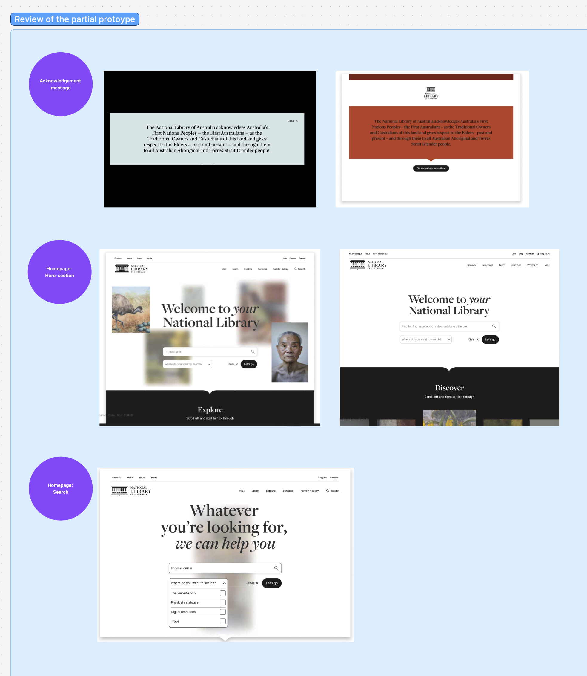
A figjam board was setup to structure the workshop
Events, exhibitions and visit planning
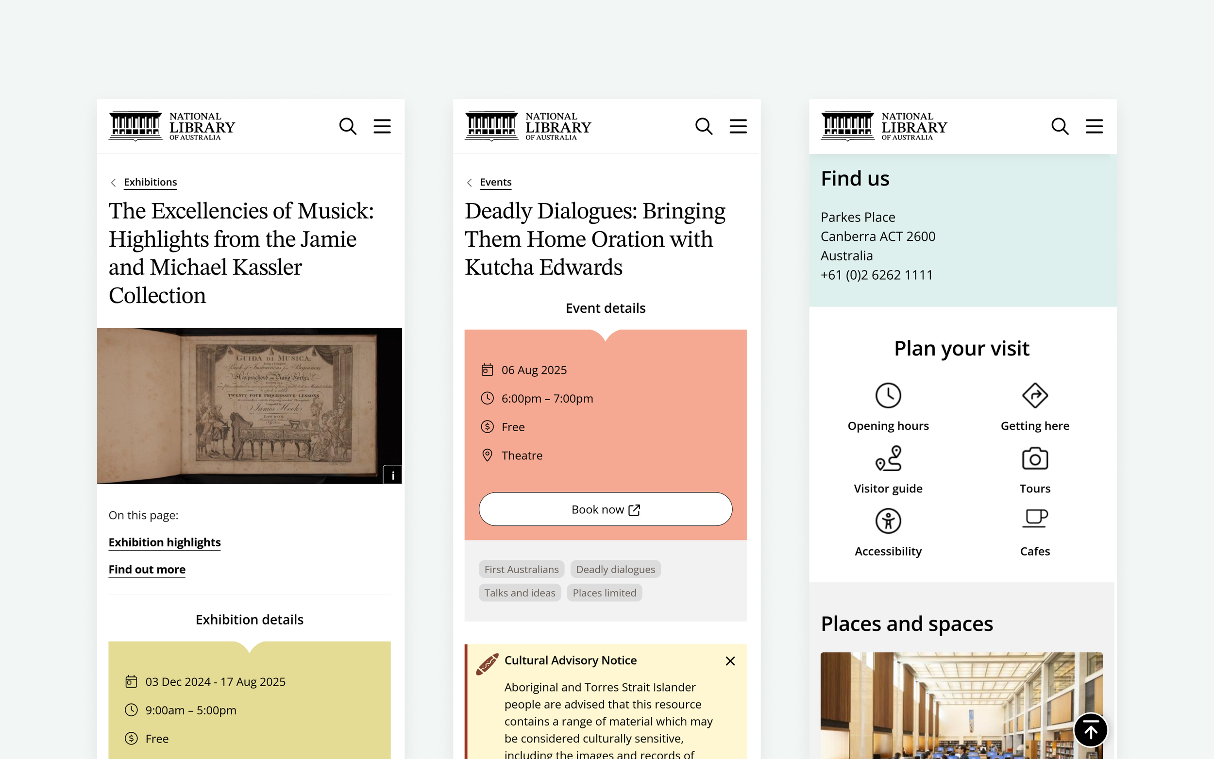
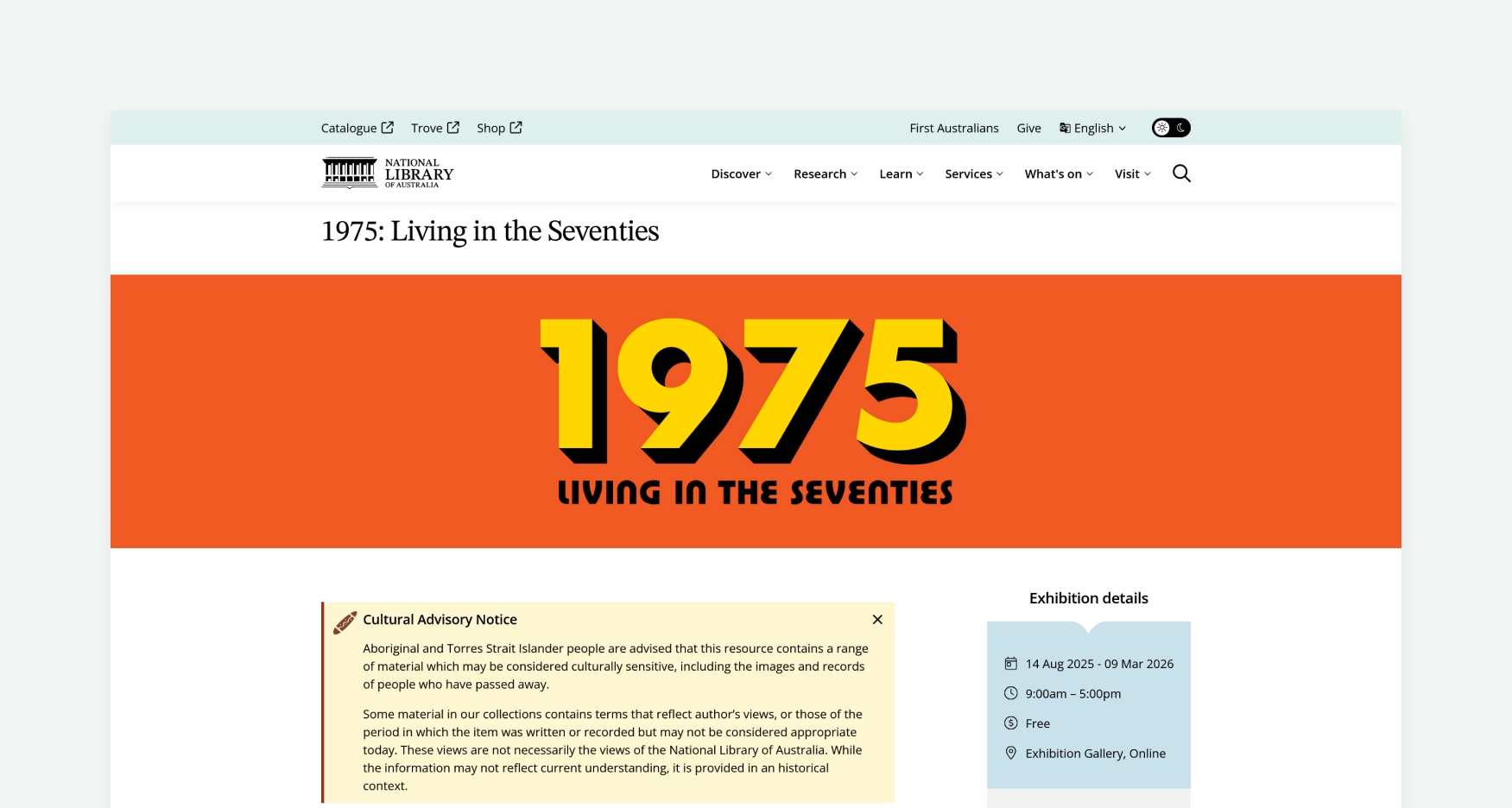
Events, exhibitions and visit planning were key pathways for helping people see the Library as open, welcoming and worth visiting. I approached What’s On as a connected journey, helping users discover what was happening, understand whether it suited their needs, plan the practical details and continue into the broader Library experience.
Audience research showed that many people still misunderstood what the National Library offered, often seeing it mainly as a reference library rather than a place for leisure, learning, exhibitions and events. Journey mapping also showed that visitors were making decisions before they arrived, comparing Canberra attractions, checking what was on, reviewing facilities and saving details into an itinerary.
I worked through this journey in wireframes, defining the structure, hierarchy and content patterns that would help users make decisions earlier. The exhibitions listing introduced tabs for current, upcoming, past and online exhibitions, making it easier to browse by intent and giving people outside Canberra a clearer pathway in. Access and inclusion details were pulled onto listing cards, while detail pages gave more prominence to key event information, supporting content, gallery highlights and 3D walkthroughs.
This shifted events and exhibitions from standalone promotional pages into a clearer planning pathway. Users could better understand what was on, what to expect and whether an experience suited their needs, while the Library gained a more consistent and reusable system for publishing visit-related content.
Before
The previous exhibitions experience made it harder to browse, compare and understand what was on
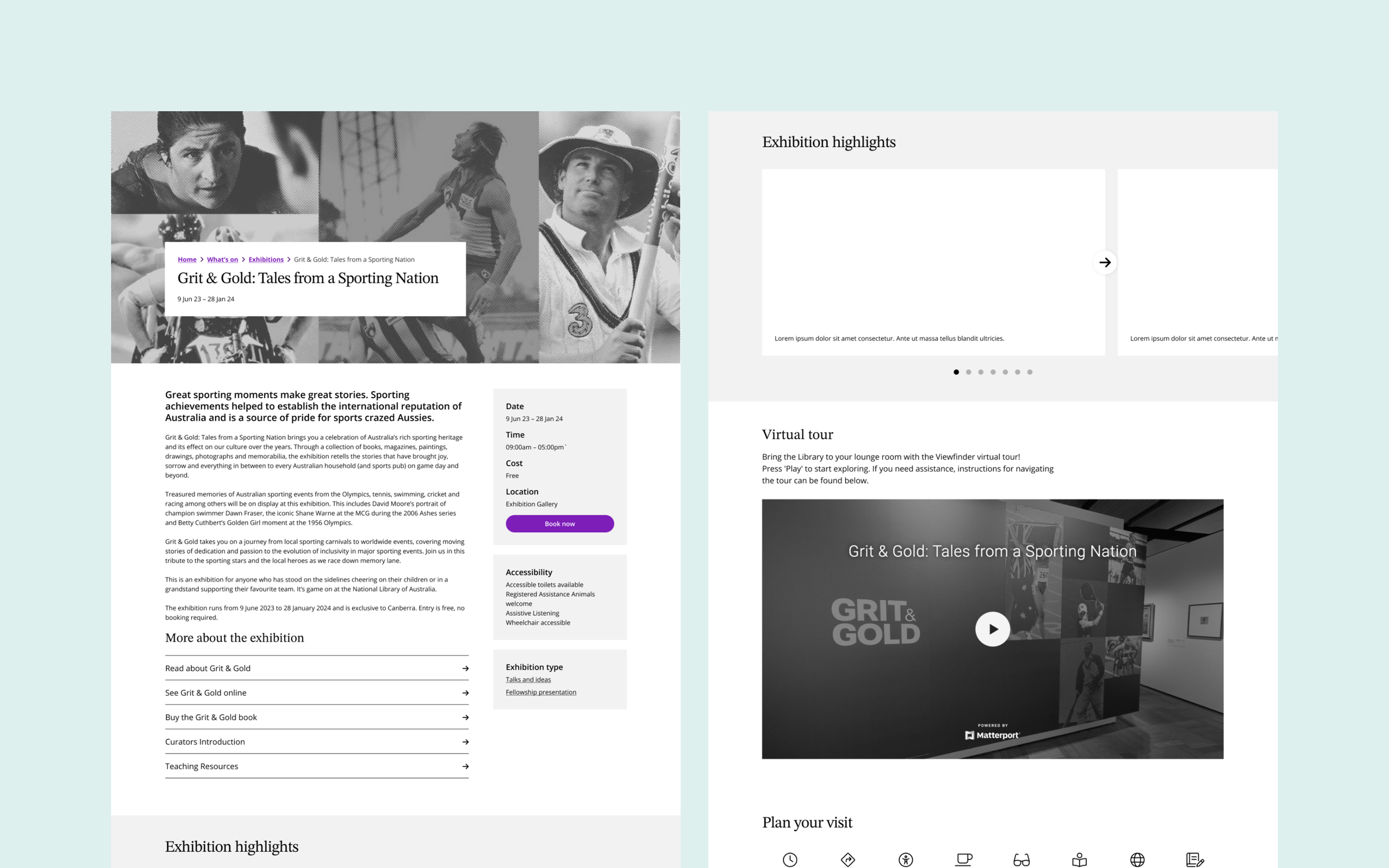
Wireframes for the exhibition detail page
After
The redesigned exhibitions journey made browsing clearer, surfaced access details earlier and gave visitors richer ways to explore.
Discover and explore the collection
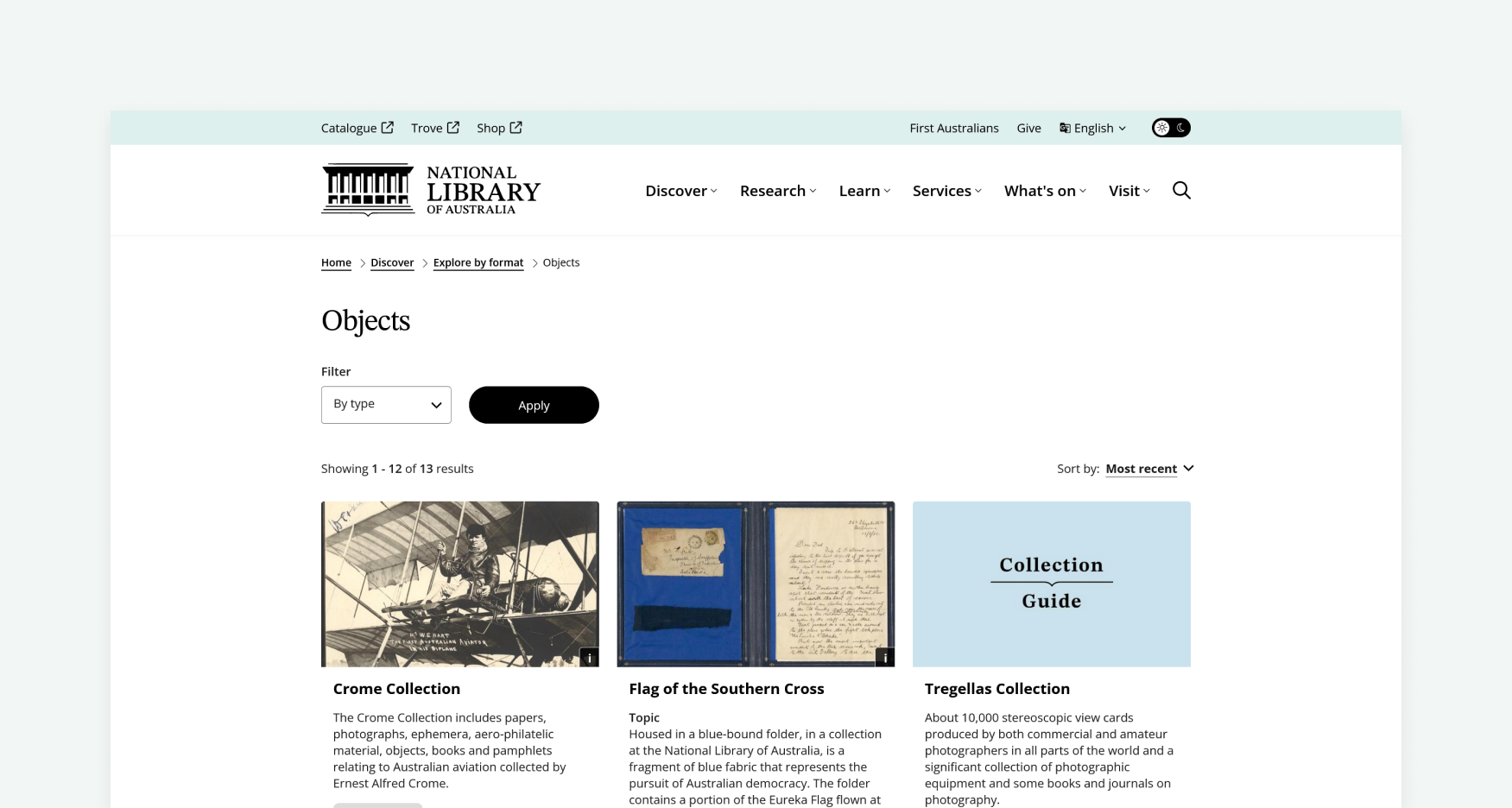
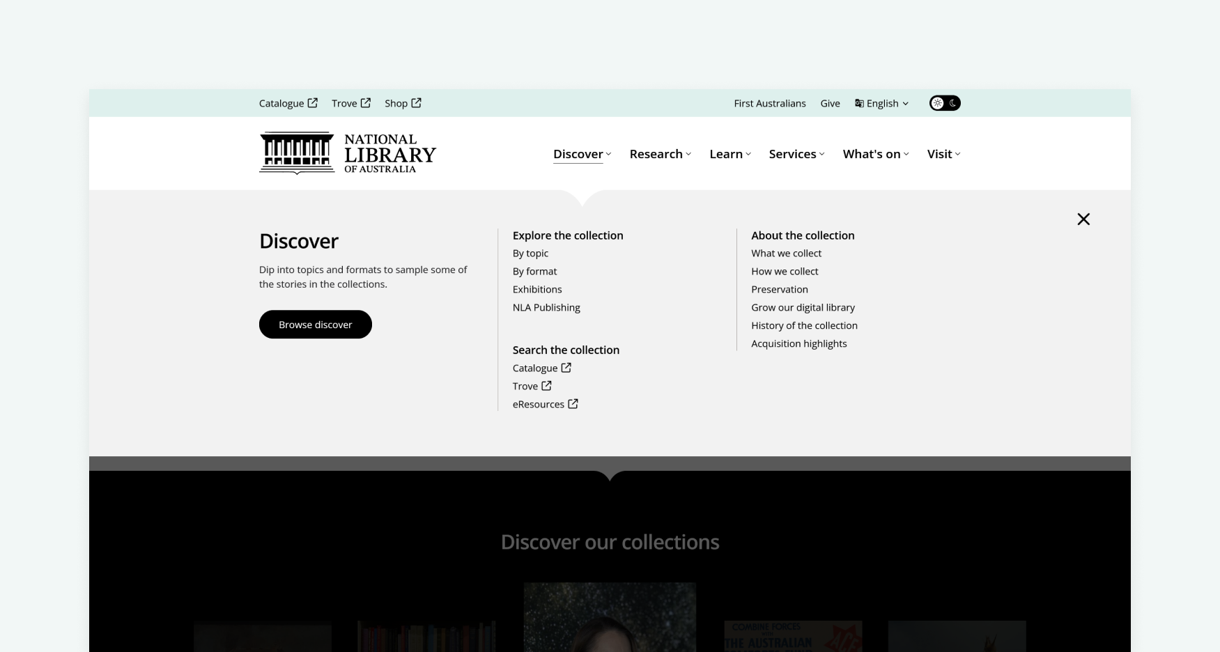
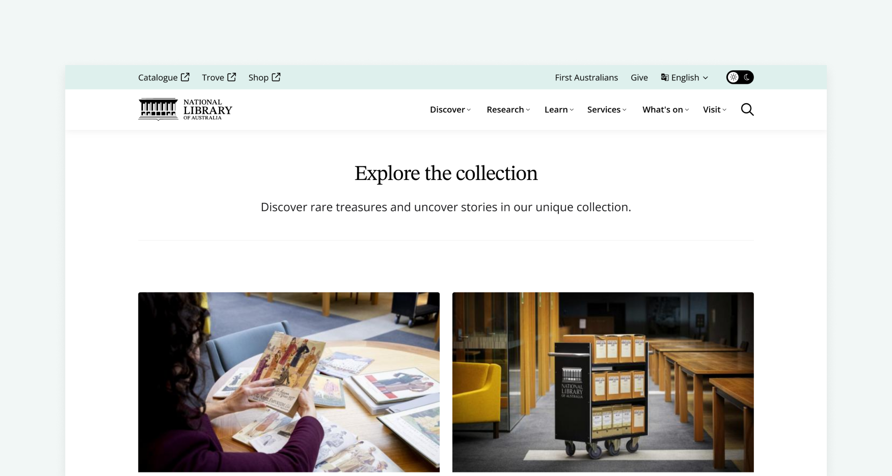
The Library’s collection was central to the redesign, but the challenge was making it easier for different users to find a way in. I approached Discover as a guided entry point, helping users move from broad curiosity into more specific topics, formats, resources and collection pathways.
Audience research and journey mapping showed that discovery often started with a broad interest, a Google search, an exhibition visit or a personal research goal. Users did not always know whether to search the catalogue, browse Trove, read a guide or explore related content, so the experience needed to make those next steps clearer.
I worked through this in wireframes, shaping Discover, topic and format pages around clearer browsing pathways and reusable content patterns. The new topic pages acted as dynamic listings powered by taxonomy, bringing together related blogs, collection guides, digital classrooms, events and exhibitions in one place. On topic and format pages, an ever-present “We’re here to guide you” sidebar gave users clear routes into key actions like browsing topics, searching Trove, using the catalogue and finding research resources.
This created a more approachable layer between broad curiosity and deeper research tools. Users could start with familiar interests, uncover relevant collection material and move through the site with clearer next steps, while the Library gained a reusable structure for surfacing connected content over time.
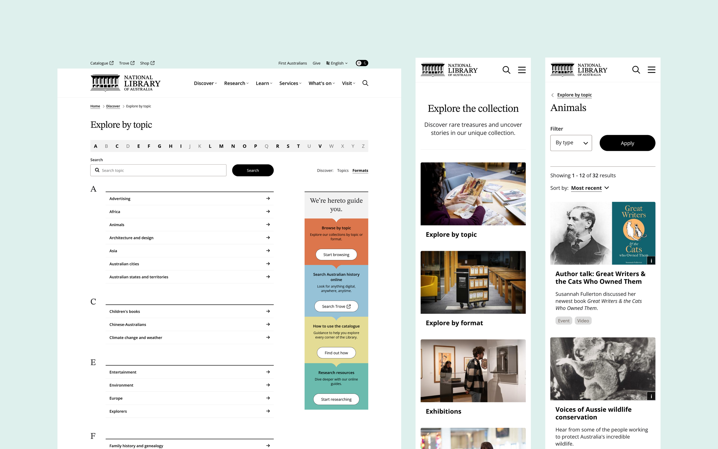
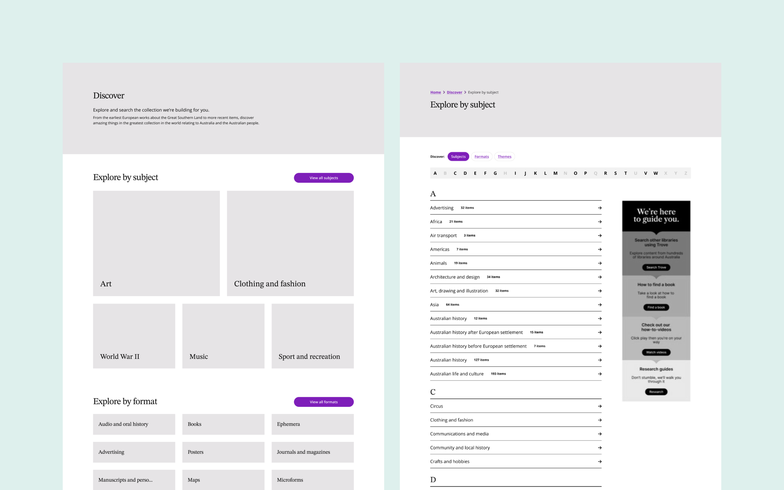
Wireframes for the exhibition detail page
Extensive testing
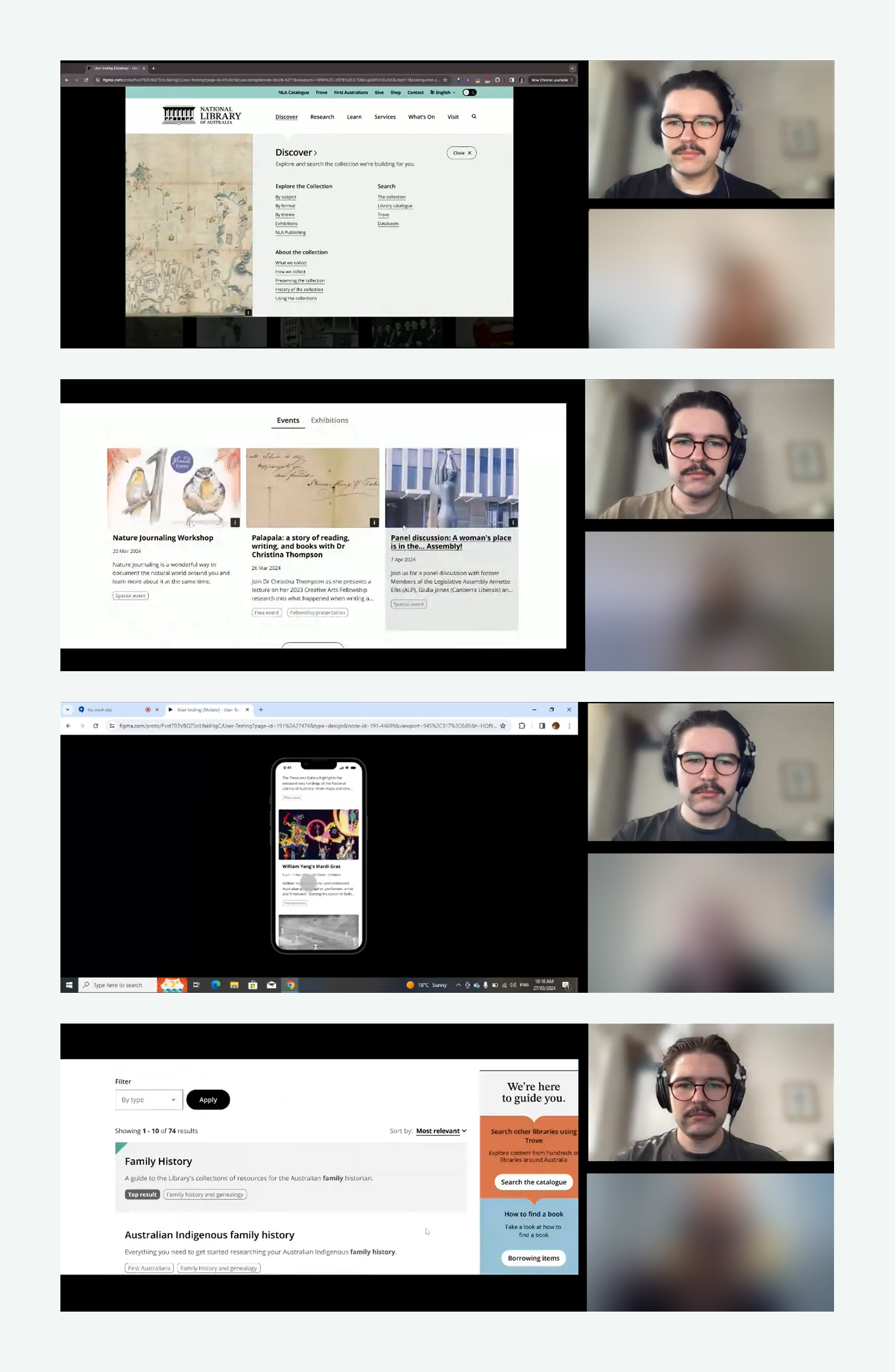
I led a series of usability tests throughout the project to validate the design, challenge assumptions, and ensure it aligned with both current and potential future user groups. This involved three rounds of testing: a Figma prototype, private beta, and public beta websites.
For each round, I developed a detailed research plan outlining the research scope, session format, recruitment brief, and task structure. A key challenge was ensuring the design worked well for a diverse audience. To address this, I managed recruitment through Askable, using their screening tools to filter participants by age, gender, location, language background, accessibility needs, and interest areas. This ensured representation from groups including First Nations people, CALD communities, and people with disabilities. Sessions were conducted remotely, enabling inclusive participation from across Australia.
Key findings and design impact
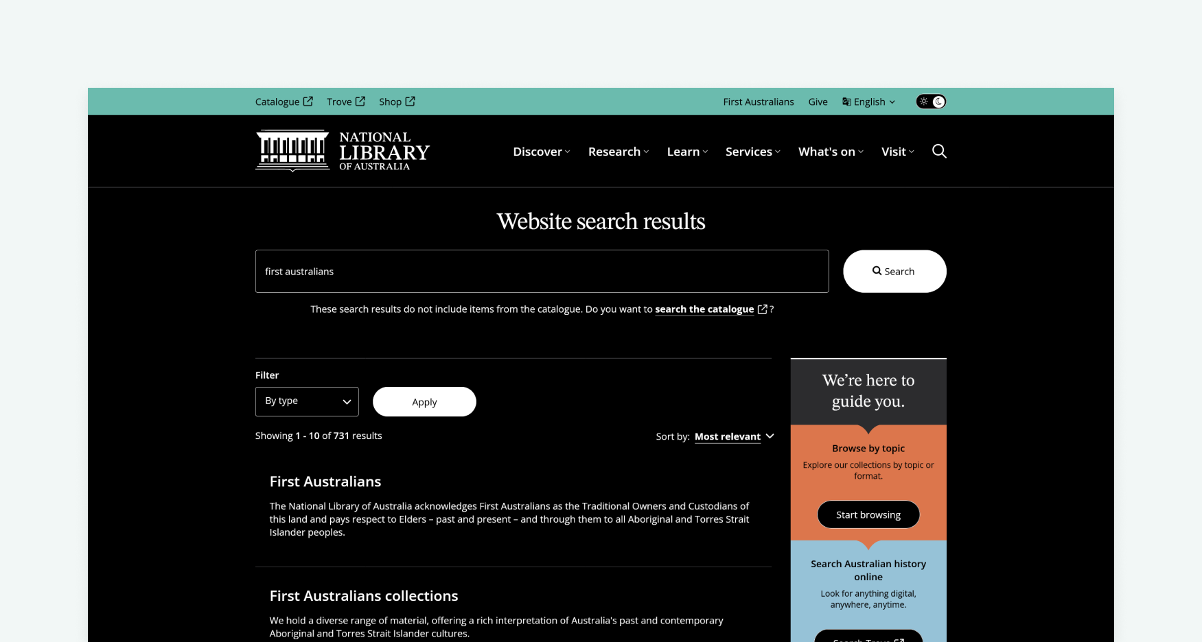
Many users struggled to distinguish between website search and catalogue search, so we refined explanatory text and improved the UI treatment around search entry points.
Several participants did not realise main menu labels were clickable, which led to clearer styling and stronger visual cues in the mega menu.
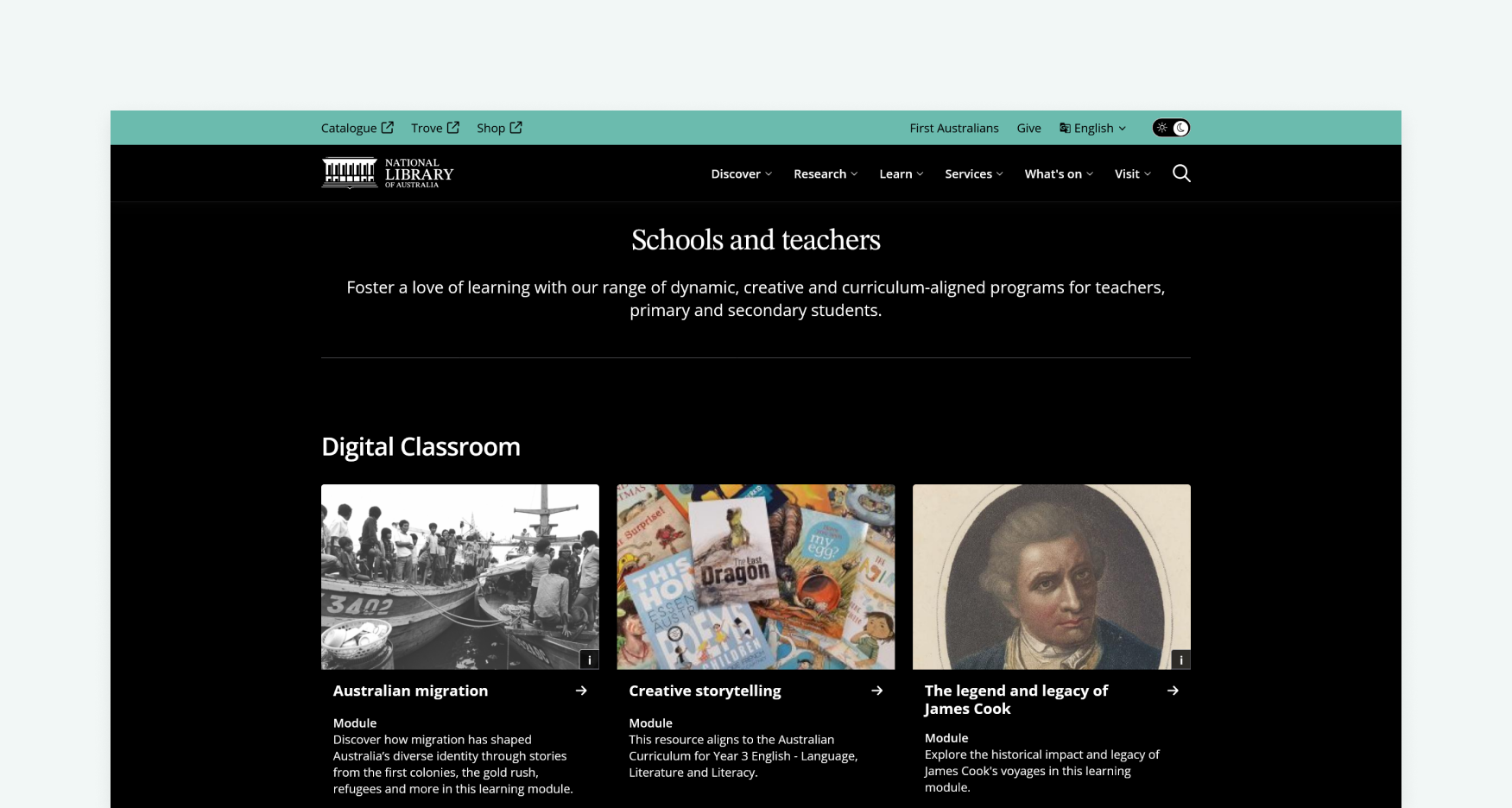
Accessibility features such as dark mode, large text and clear page structure were positively received, with feedback helping refine typography hierarchy and mobile navigation.
Some pages, including exhibitions, created a “false floor” where users missed additional content, so we adjusted page structure, spacing and scroll cues.
The First Australians page was easy to find, but users expected more depth, leading to recommendations around richer cultural content, clearer labels and stronger pathways into related material.
Each round produced practical findings that shaped the final design. Testing helped move the site beyond internal assumptions, creating a more inclusive, accessible and usable experience for a wide range of Library audiences.
Establishing a design system
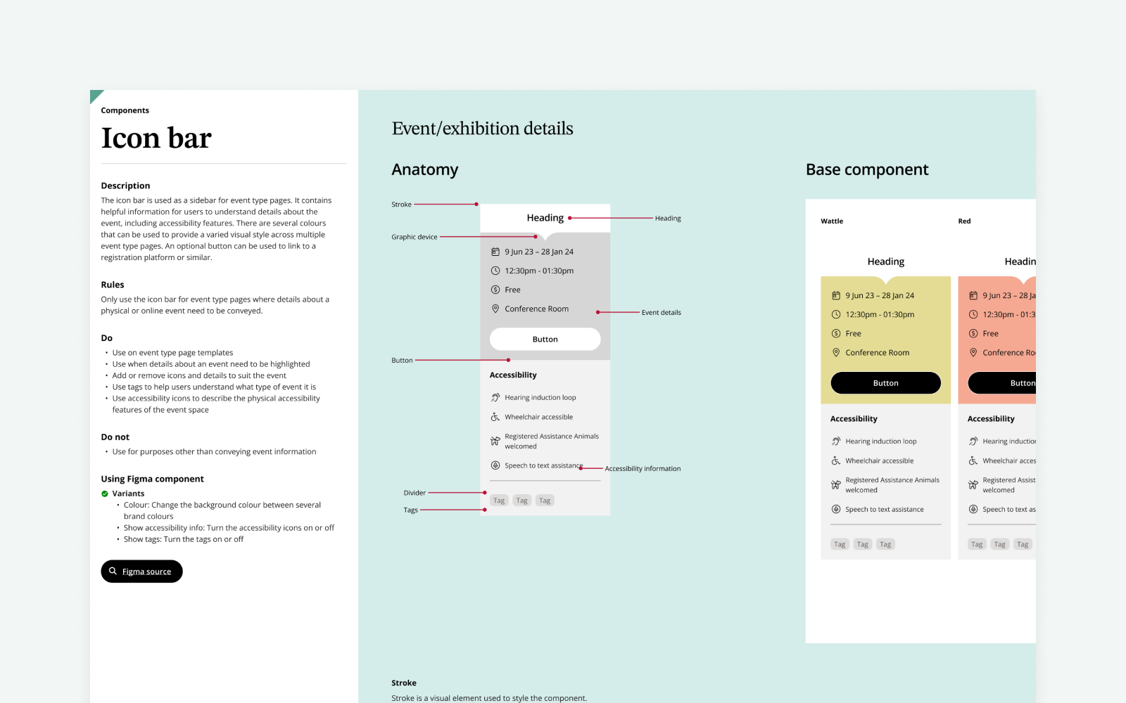
The website redesign also shaped the foundation for the NLA Design System, a figma based library designed to create a more consistent, accessible and scalable experience across Library branded digital products.
While the UI designer built the core system, I provided UX guidance and authored key documentation around structure, usage and governance. My focus was making sure the system was practical for the people who would use it, including designers, developers and internal Library teams.
This included defining guidance for accessibility, layout behaviour, content usage and brand consistency across foundations such as colour, typography, iconography, navigation, components and page patterns. I also helped ensure each element had clear usage rules, do and don’t guidance, and enough context to support consistent decision making beyond the website itself.
The result was a design system that did more than document the new interface. It gave the Library a shared framework for maintaining quality, reducing ambiguity and extending the brand across future digital platforms.
Result and reflection
This project sharpened my ability to navigate complex stakeholder dynamics and design within real-world constraints. The client’s strong and sometimes unconventional preferences required careful balancing between internal expectations, existing brand work and user needs, which ultimately strengthened the design outcome.
It also reinforced the value of testing throughout the project. Each round uncovered practical issues that may have otherwise been missed, including the “false floor” on some pages where users assumed the content had ended too early. These findings gave us clear evidence for refinement and helped keep decisions grounded in real user behaviour.
The design system work was another important learning point. In a lower maturity environment, clear documentation only goes so far. The system also needed practical examples, plain guidance and enough internal confidence for teams to use it consistently.
Through UX strategy, wireframing, usability testing and design system guidance, I helped deliver a website that is more accessible, intuitive and aligned with diverse user needs. The project was nationally recognised, winning Best Government Website at the 2025 Australian Web Awards and a 2025 Australian Good Design Award.